Myoung Ho Lee
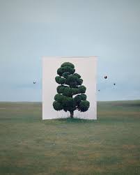
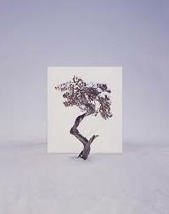
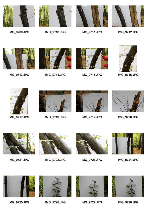
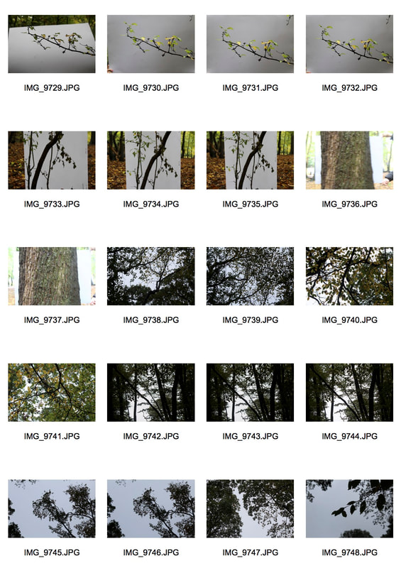
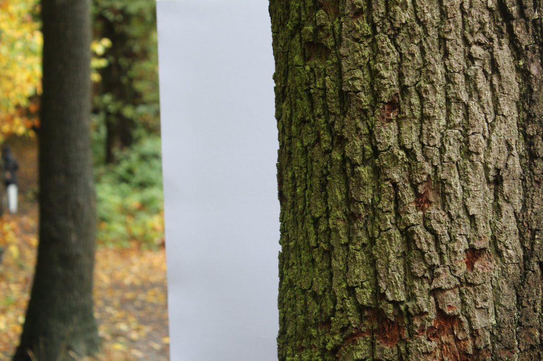
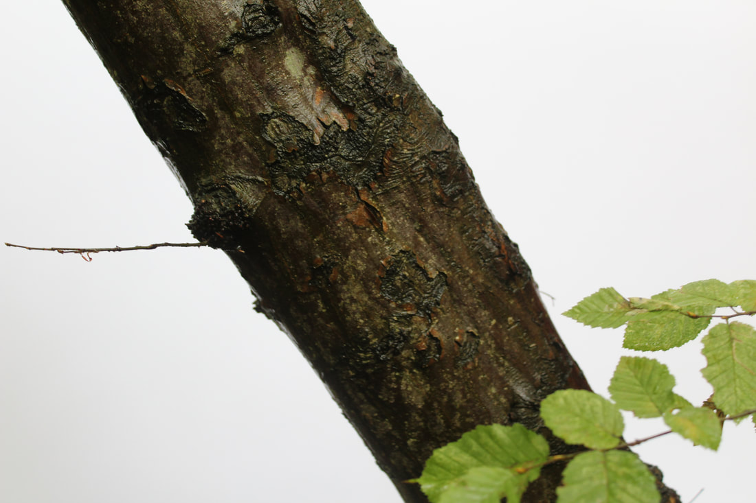
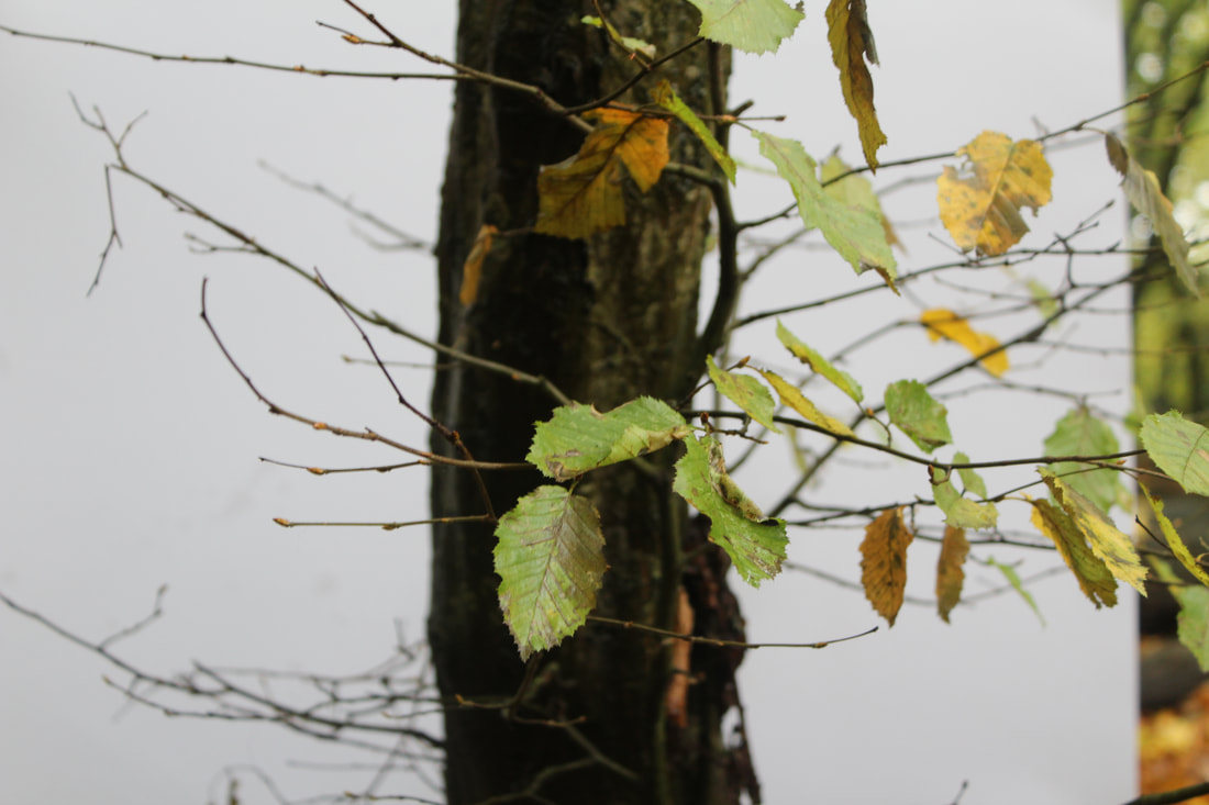
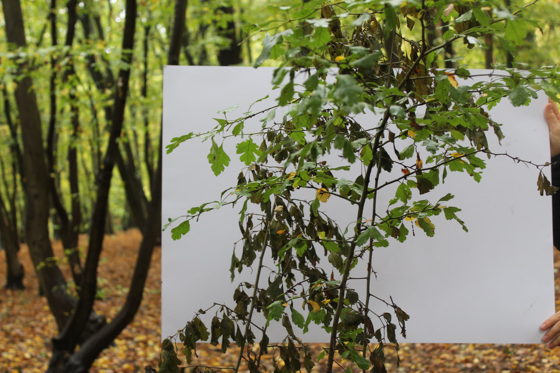
Myoung Ho Lee is an artist from South Korea. He attended the College of Arts in the Joong-Ang University in Seoul. He has won multiple awards for his work over the years. In his artwork, he uses large white sheets behind trees to show separation from reality. This sheets allow the tree to look detached from its surroundings.
|
|
|
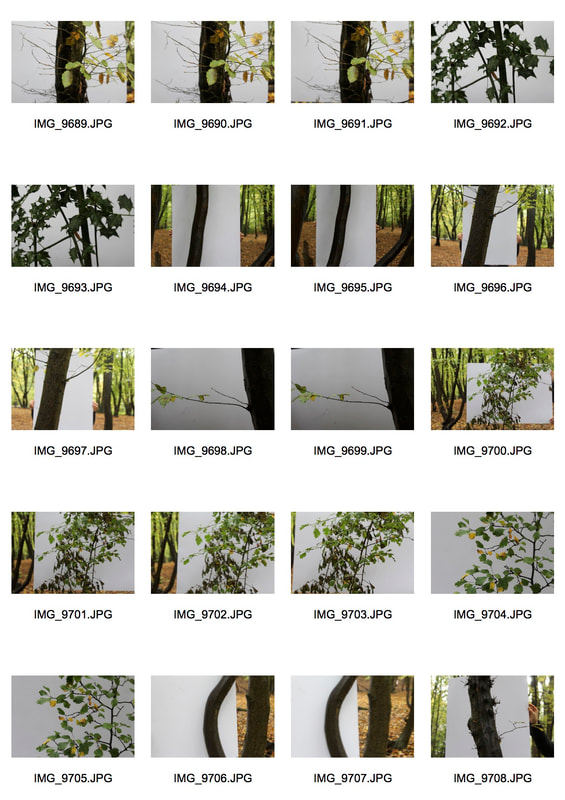
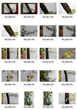
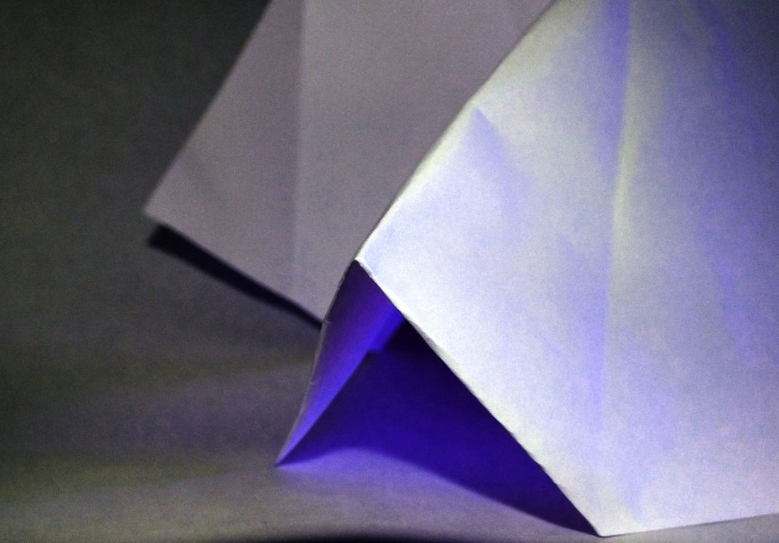
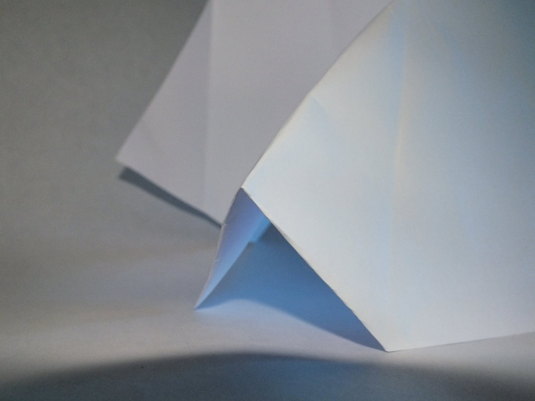
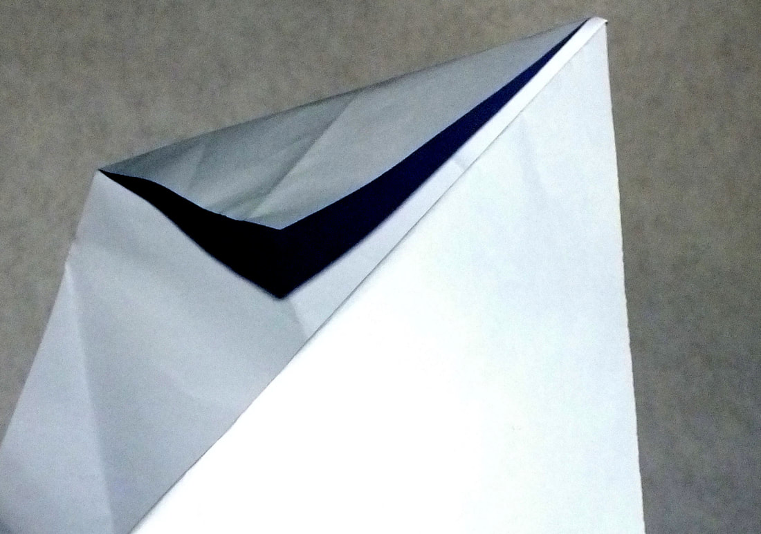
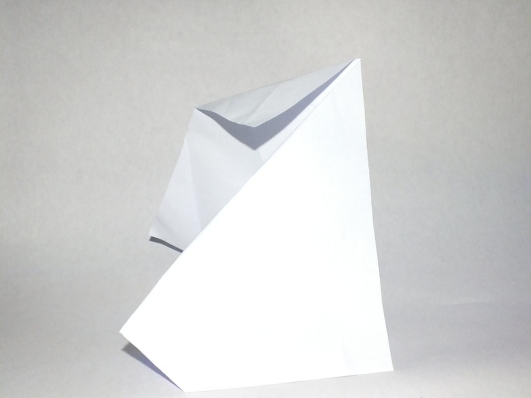
As a response to Myoung Ho Lee's work we went to Coldfall woods to photograph a white Sheed of card in nature to recreate his work.
|
|
|
|
|
|
|
|
|
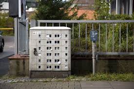
EVOL
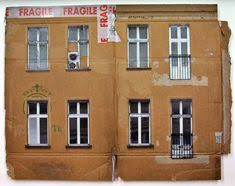
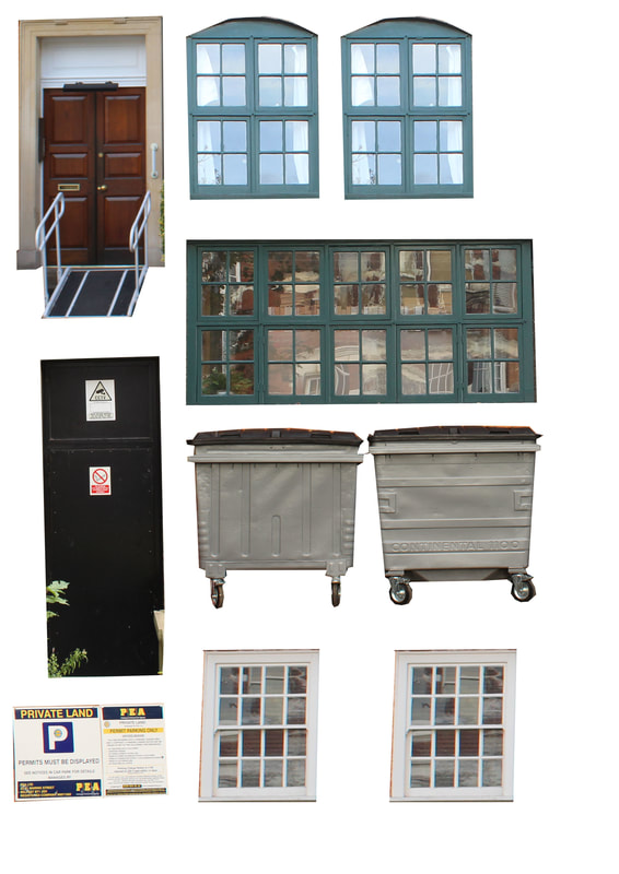
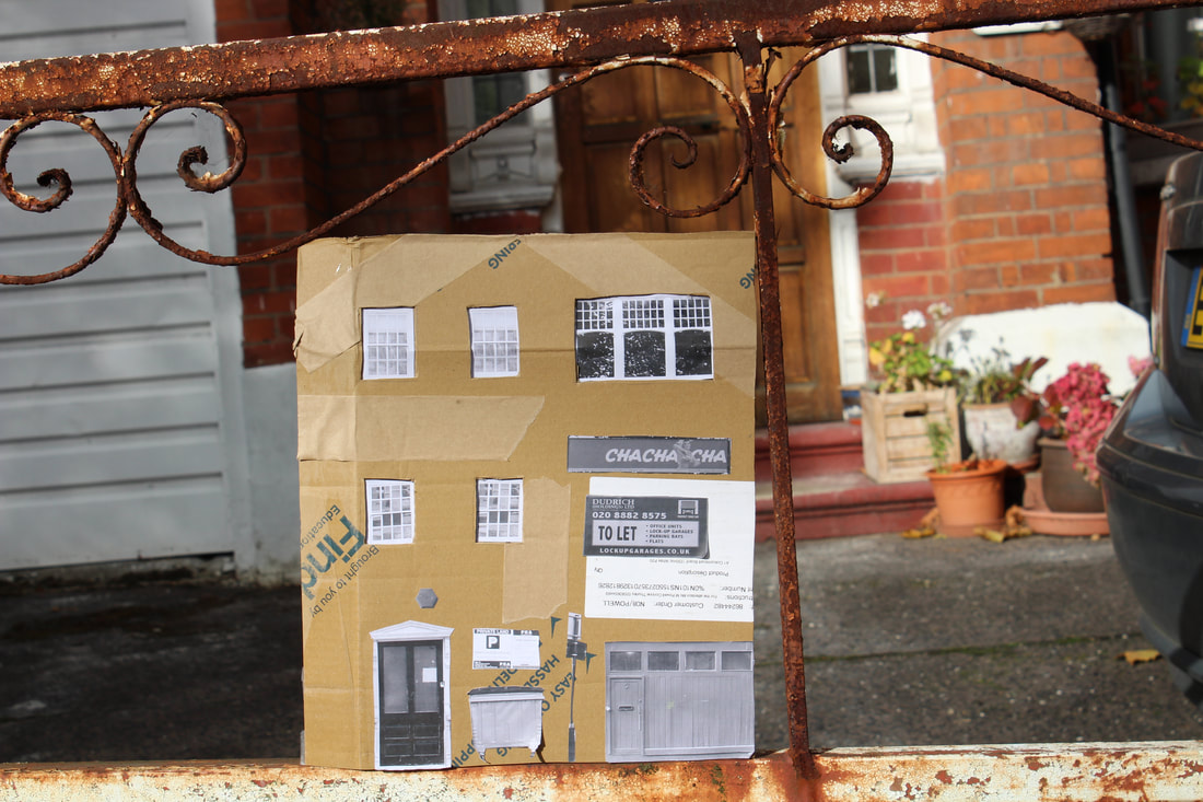
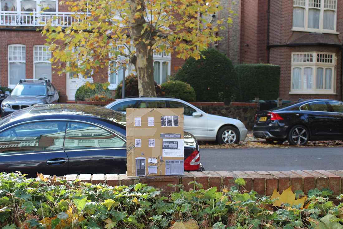
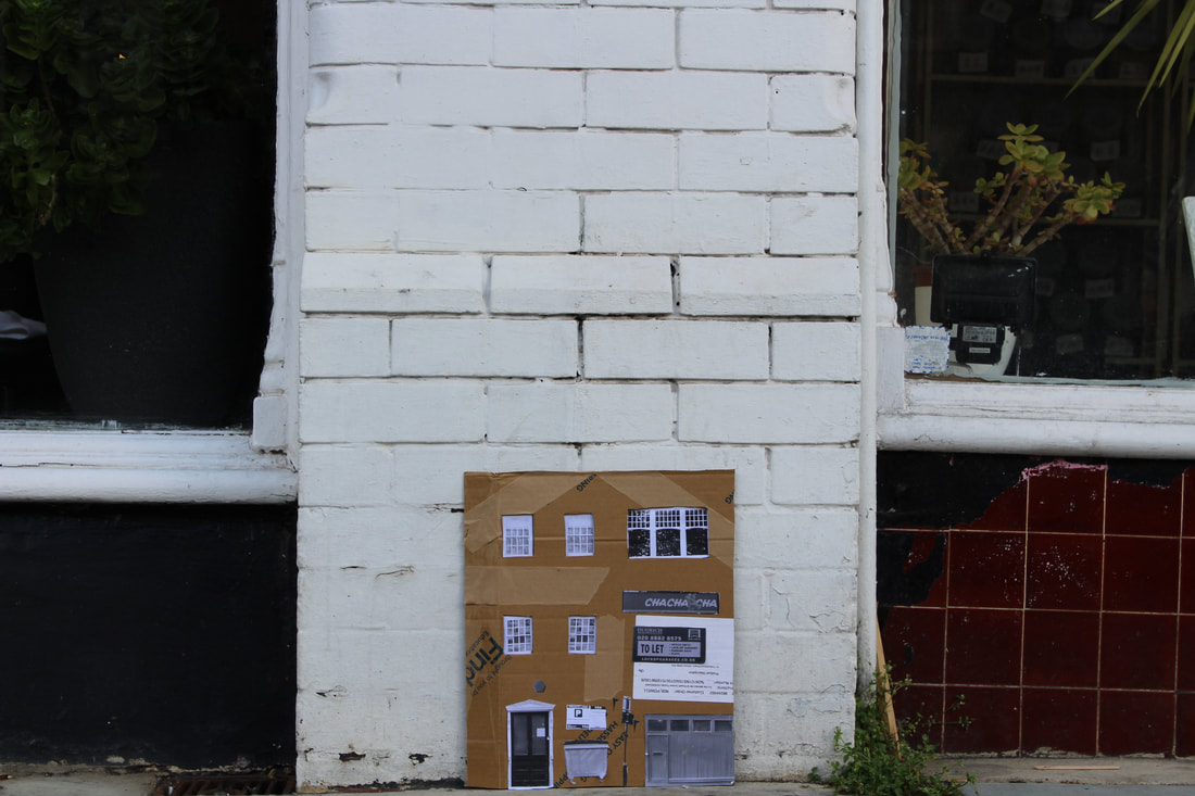
EVOL is a German artist who works with photoshop, painting and cardboard. He takes pieces of cardboard and adds small cutouts of building structures such as windows, doors, scaffolding or satellites to portray the pieces of cardboard as smaller buildings. He then places this pieces in real locations and photographs them so they appear as miniature structures within a larger city. He also works with photoshop to edit the sides of buildings onto smaller structures such as plant pots or boxes in the street to make it appear as though they are buildings and estates. These are more realistic looking than the cardboard structures as he takes a full photo of the building he is editing. He likes to work primarily with housing estates and more urban looking structures.
|
|
|
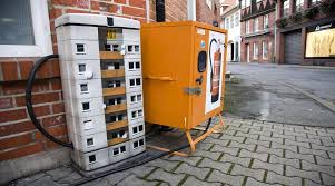
MY RESPONSE
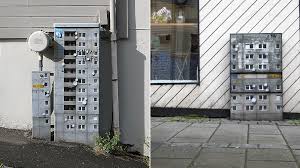
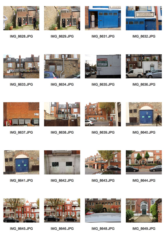
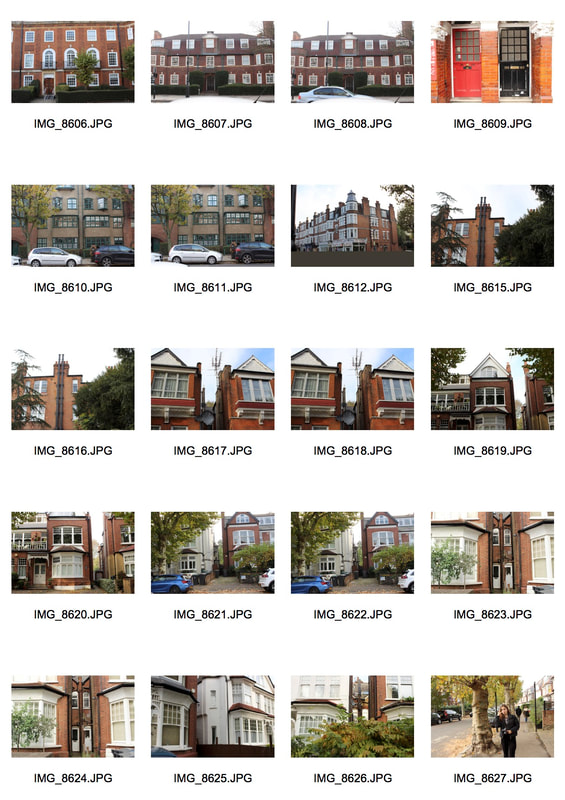
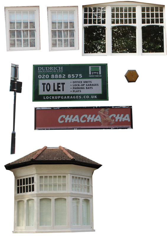
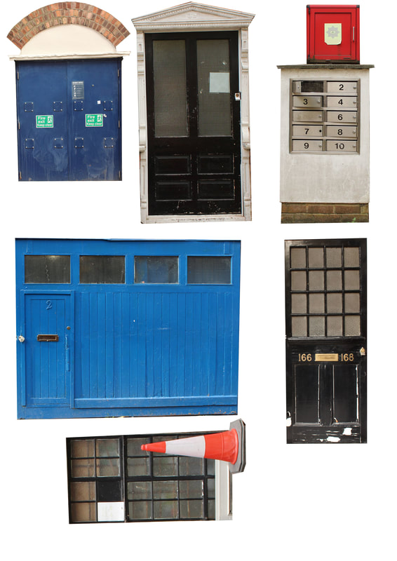
As my response, I made a piece similar to the cardboard box photos that EVOL has created. We used old cardboard boxes and went out to muswell hill to take photos of shops and houses in the area so we would have photos of doors and windows to use.
|
|
After photographing these, I used photoshop to cut out pictures of doors, windows and other urban objects to create my response.
|
|
|
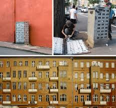
MY FINAL RESPONSE
We then went to Muswell Hill to photograph our pieces within the buildings there. This is my piece in different locations.
|
|
|
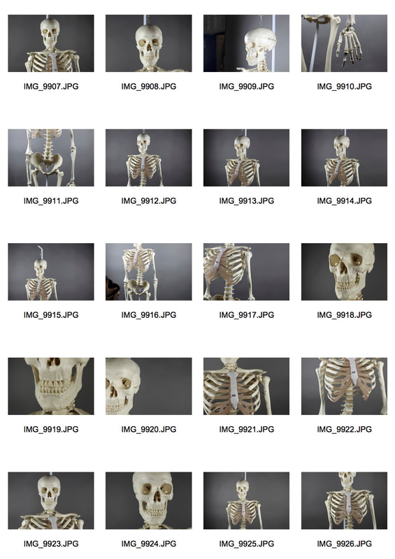
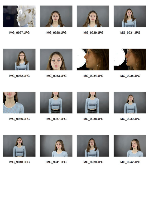
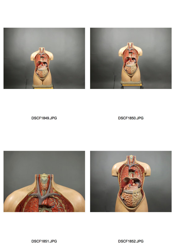
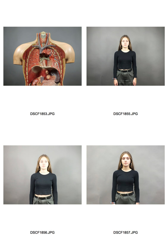
STRUCTURE OF THE BODY
SKELETON PHOTOS
|
|
BODY PHOTOS
|
|
|
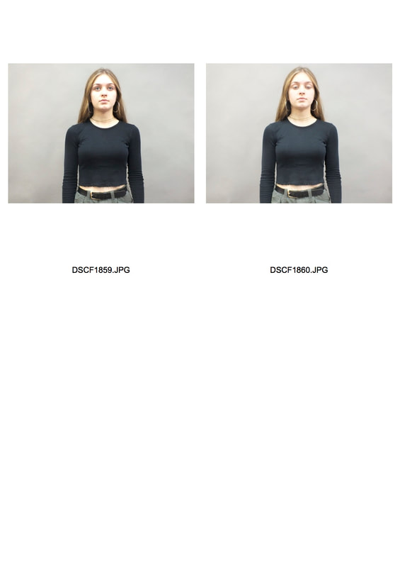
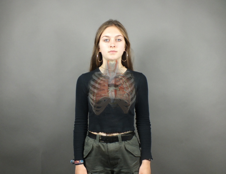
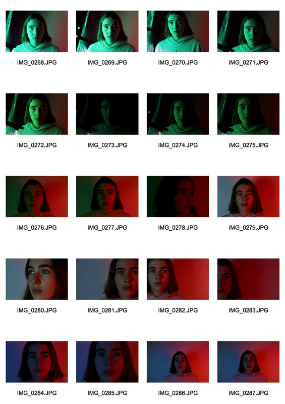
We looked at the structure of the body within photography, using a skeleton and model of the body as our objects to photograph. We took photos from all angles of these objects so we would have lots of photos we could use once we started editing them. We then photographed each other so we could layer the images of the real bodies and models of bodies to create pieces that looked like a look inside the body. These were the photos I took.
MY RESPONSE
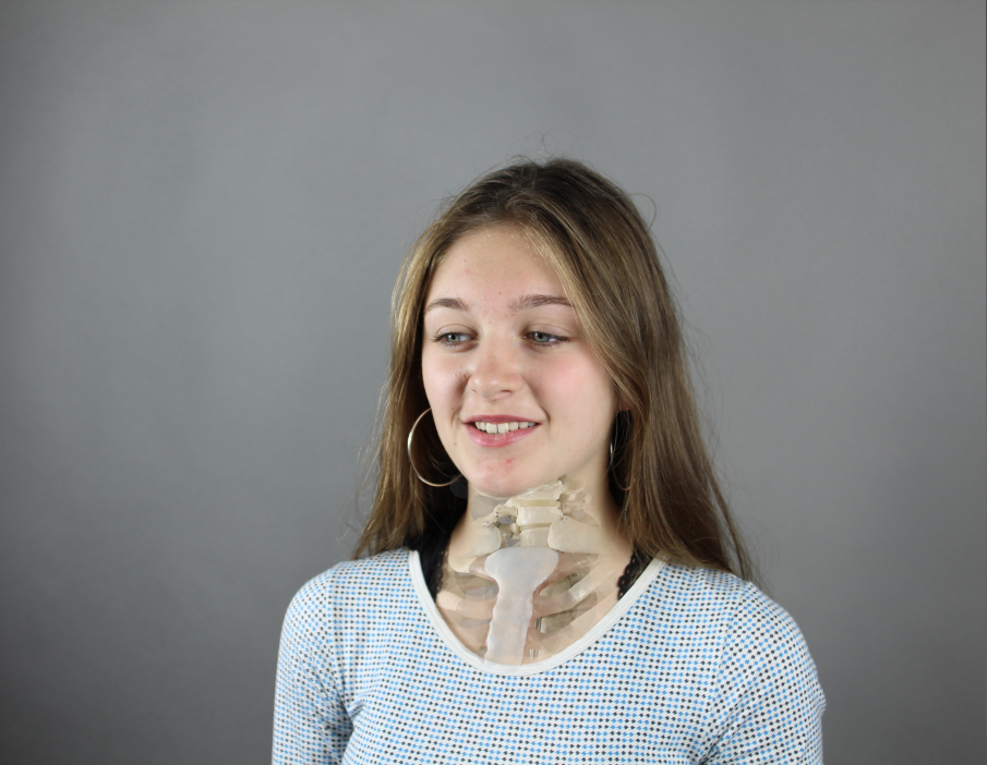
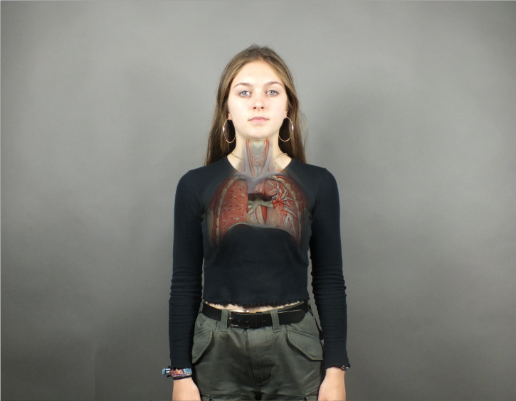
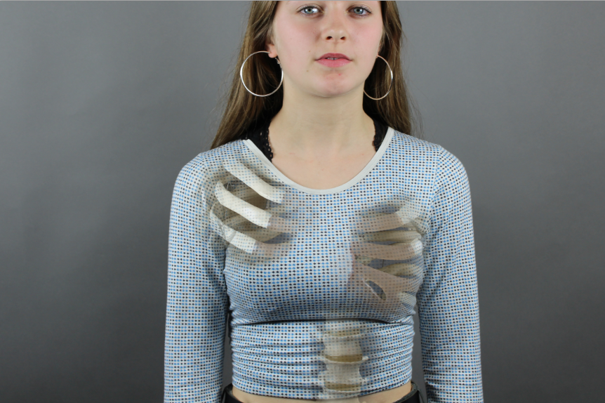
We then used photoshop to layer these images and create our final responses. I layered the two photos I wanted to use on top of each other and lowered the opacity of the top photo to allow me to line up the photos accurately. After this, I used a layer mask to work into the top photo so the skeleton or body would show through. These were my pieces.
|
|
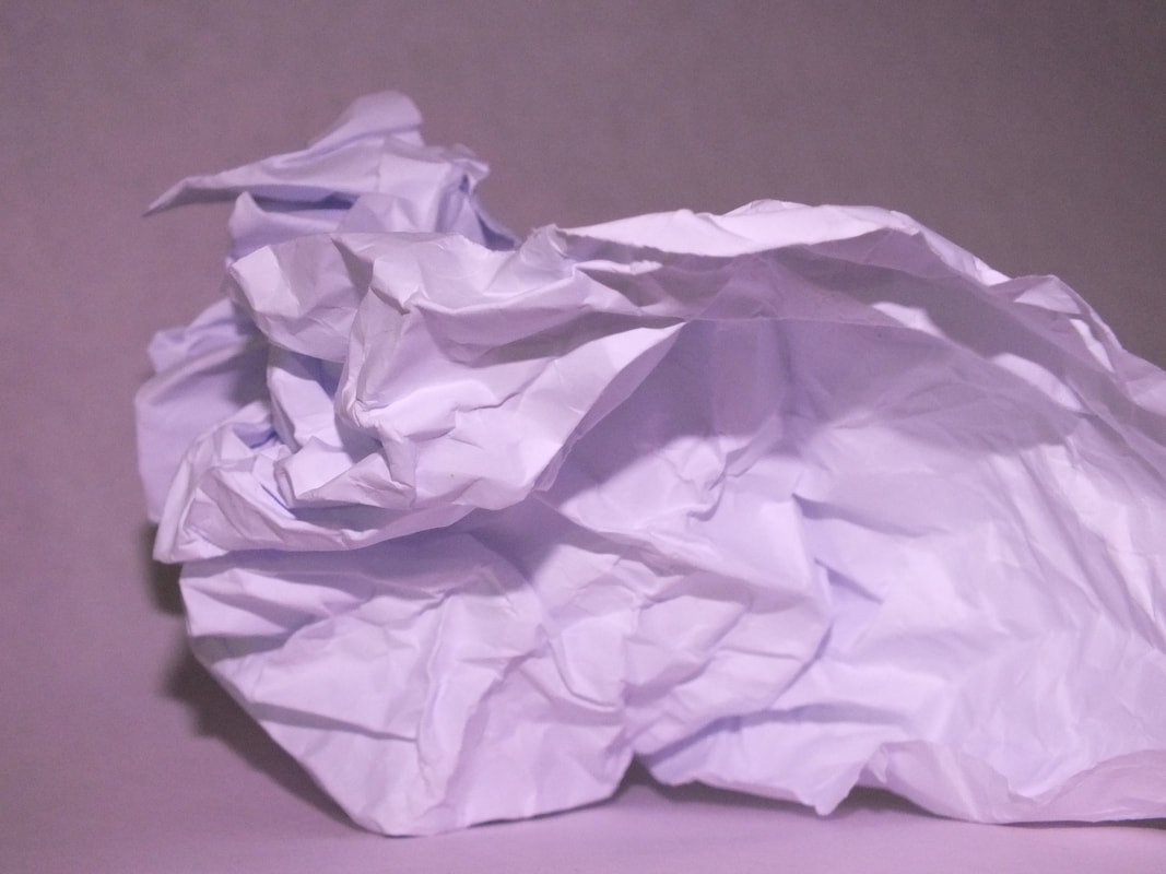
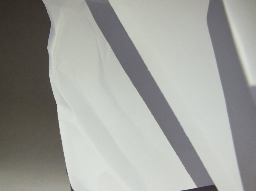
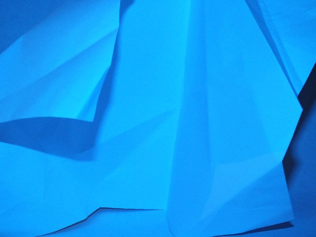
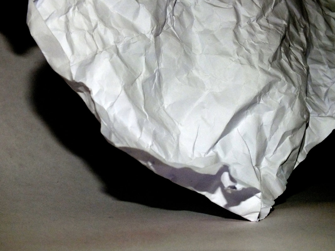
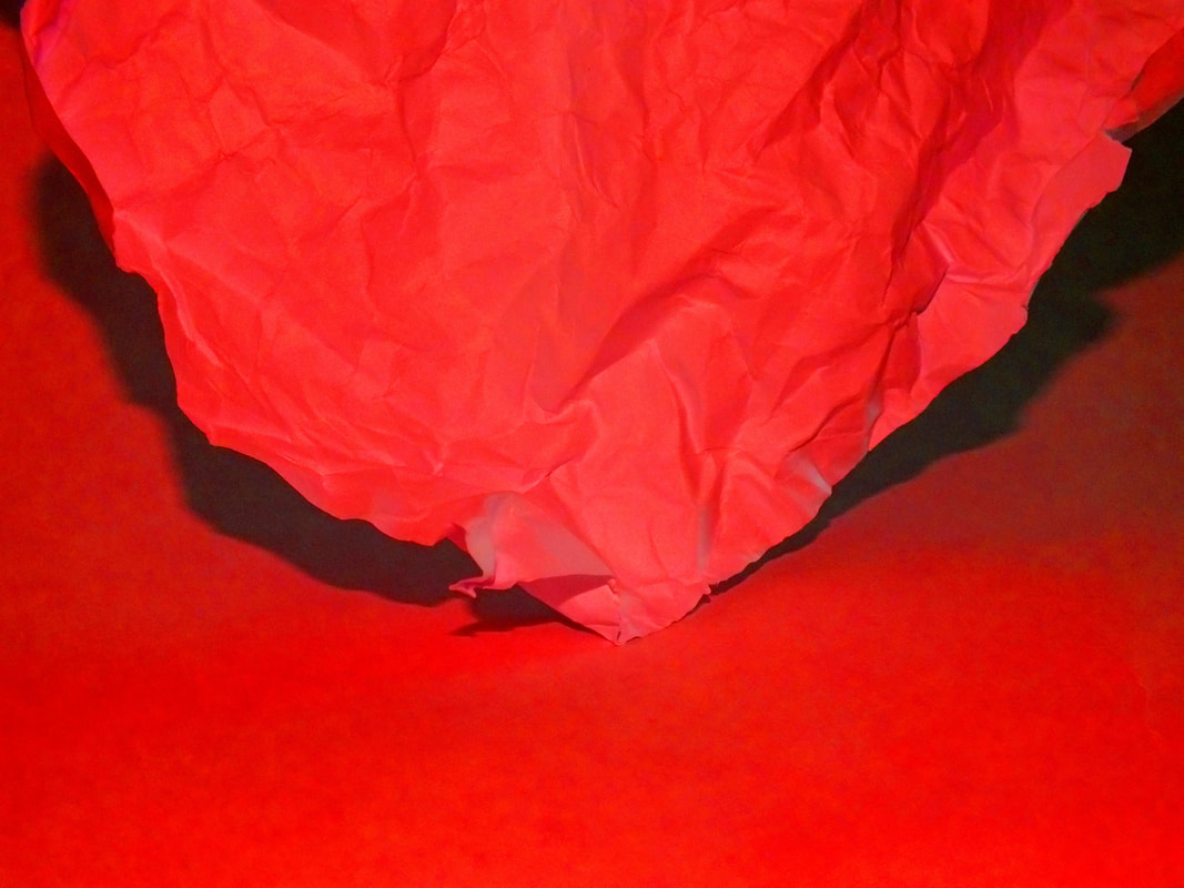
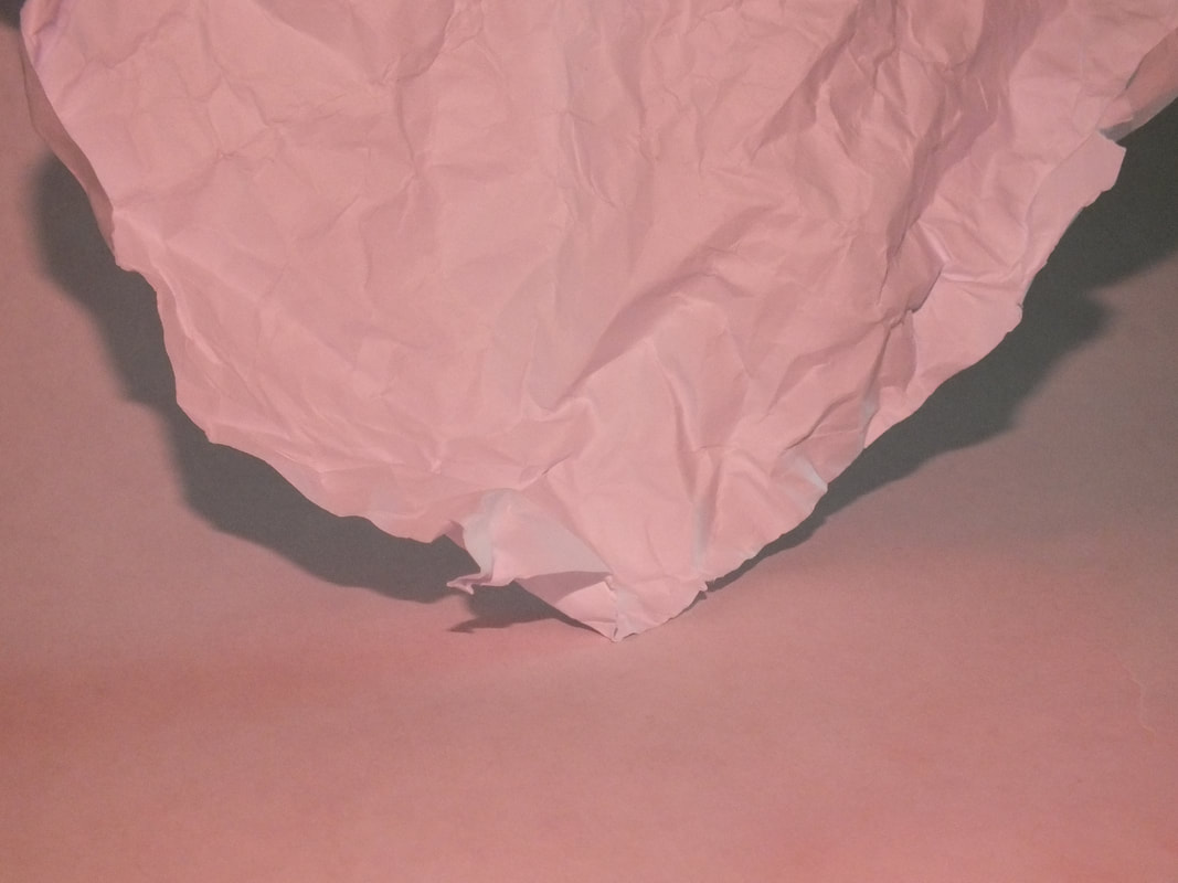
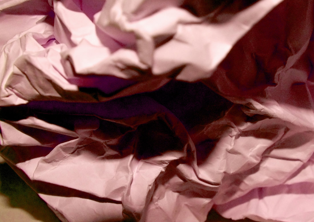
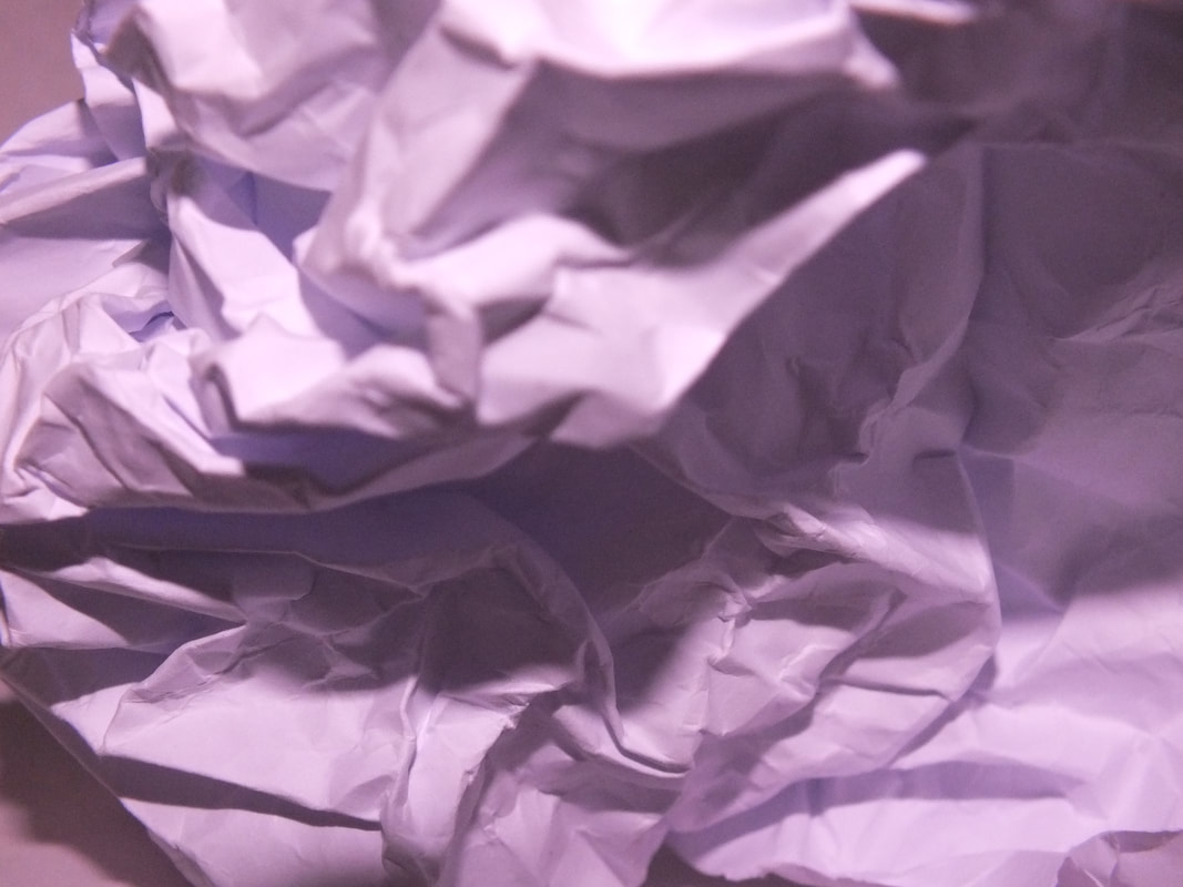
THE PAPER TEST
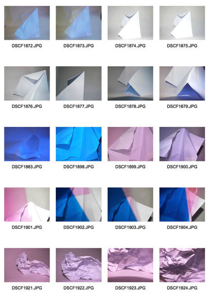
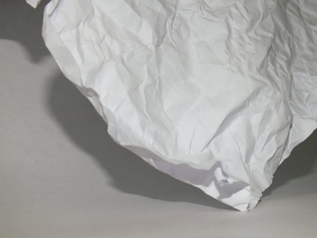
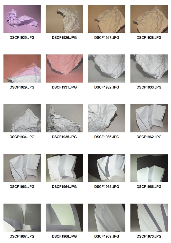
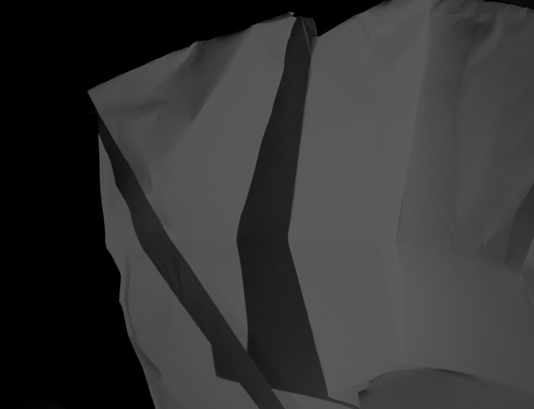
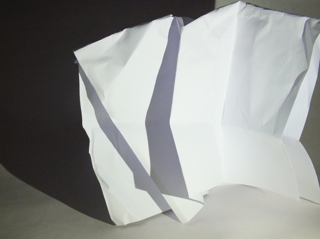
I was given a piece of white A4 paper to photograph. Our task was to fold, roll and crumple the paper without cutting or tearing it to create unique photos of our pieces of paper. We were also given coloured films to add depth to our photos. These are the photos with a few I feel worked very well.
|
|
|
|
I then used photoshop to work into my photos and adjust the brightness of the photos. By doing this, I created more depth in these photos and created more extreme versions of the originals. At either end of the brightness spectrum, the extreme change can make the photo look a more abstract.
|

|
|
|
|
|
|
|
|
|
|
|
ARTIST RESPONSES
Our next task was to respond to the work of two photographers that made more abstract pieces. The two artists I chose are Brendan Austin and Francis Bruguiére.
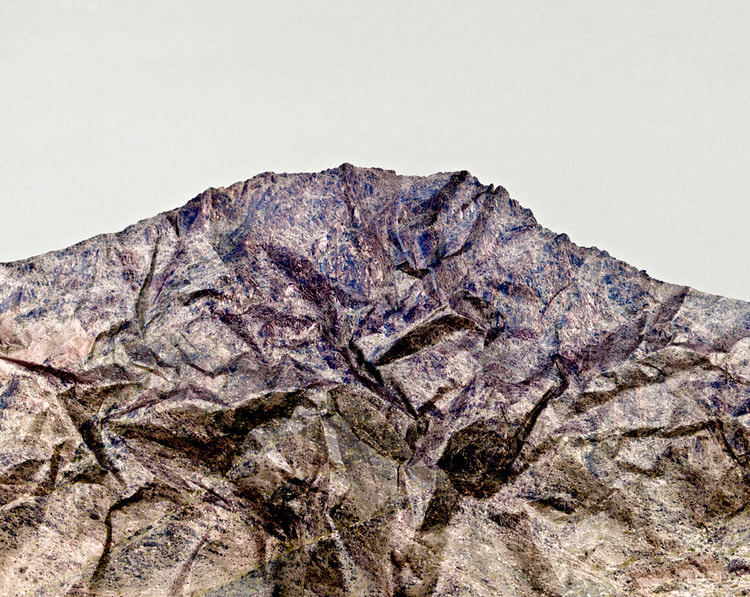
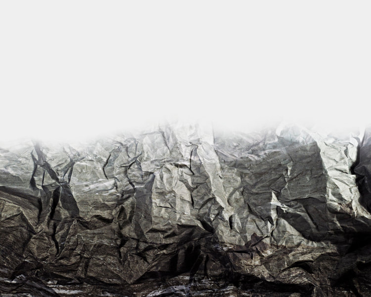
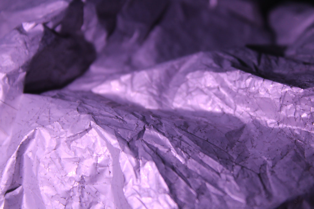
Brendan Austin
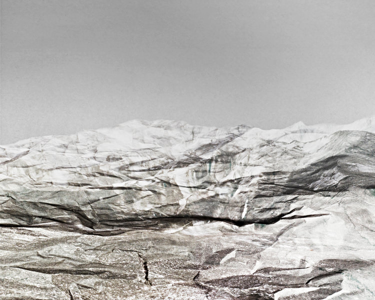
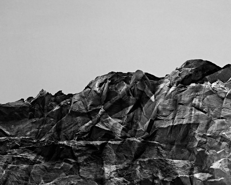
Austin photographs pieces of paper when they are crumpled or folded so they resemble mountains. After the photos have been taken, he edits them so he can increase the likeliness of the mountain structure with the photographs of the paper. As Brendan Austin frequently travels between Europe and New York so has had exhibitions in the photographers gallery in London, The centre for photography in Stockholm and he has also featured at the Miami art fair.
|
|
|
|
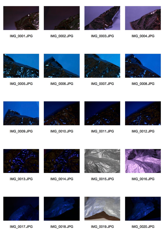
My response
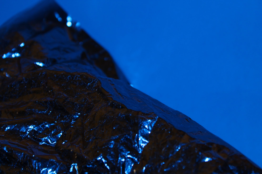
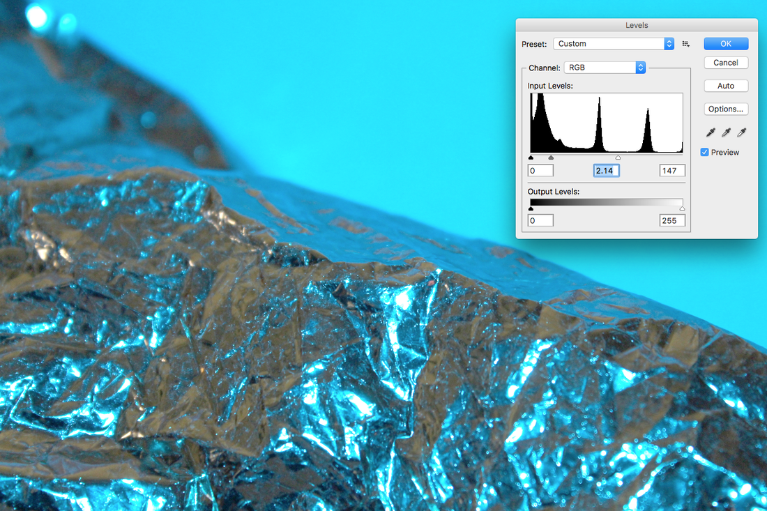
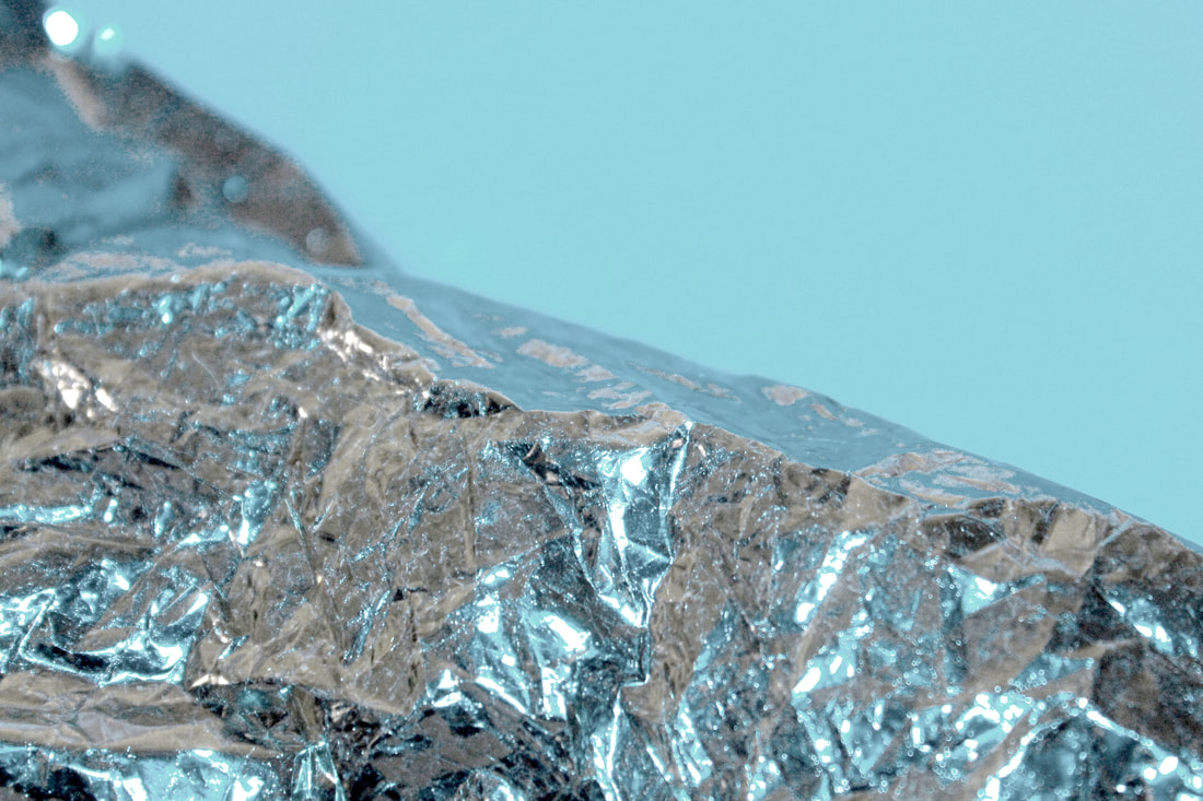
I responded by photographing gold foil paper with coloured light to darken the photographs and to create colour in the reflections.
|
|
|
|
My edited response
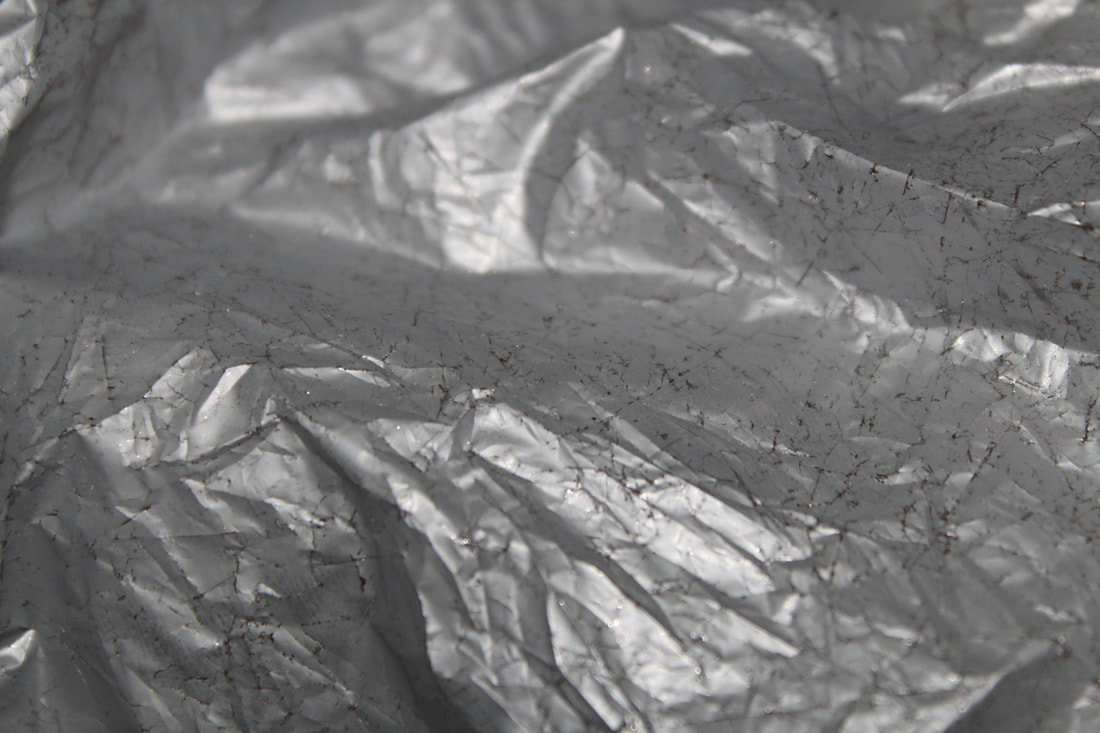
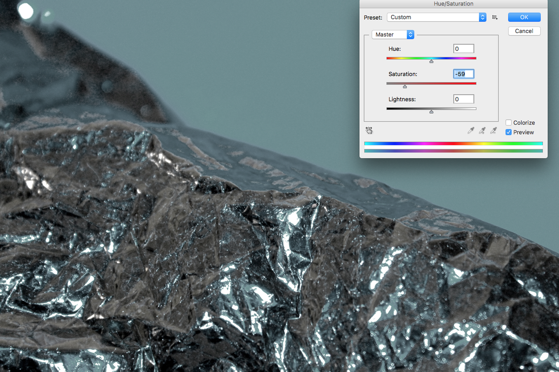
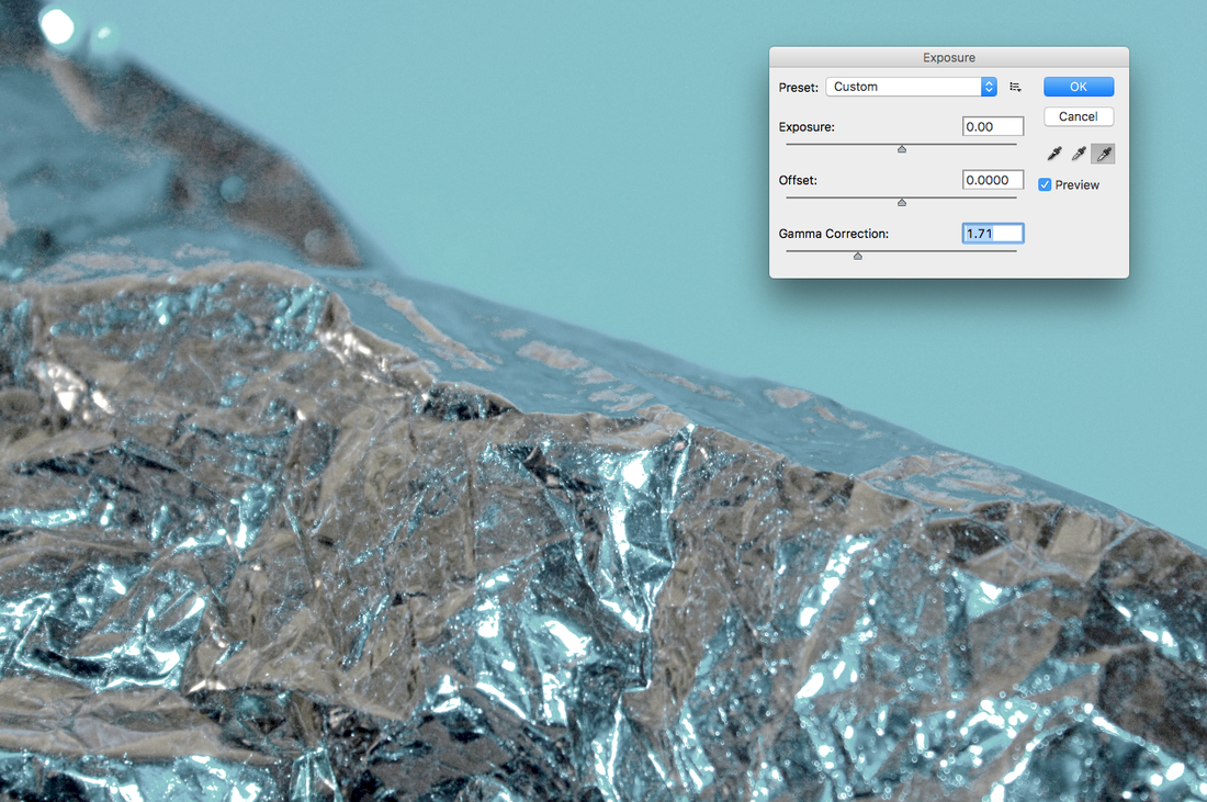
The artist edits his photos so they start to resemble mountains, so I edited my photos on photoshop so I could alter the colour and brightness of the photos, making them look more like mountains.
|
|
|

|
Final piece
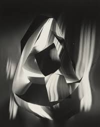
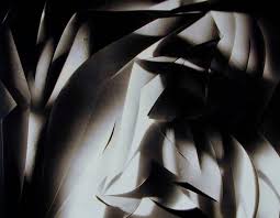
Francis Bruguiére
Francis Bruguiére grew up interested in painting, poetry and music and became an accomplished pianist. He studied painting in Europe but moved to New York and took up photography. He then opened a studio and started developing his well known style of the cut outs and exposure. In the later years of his life, he moved back to working mainly with painting and sculptures.
|
|
|
|
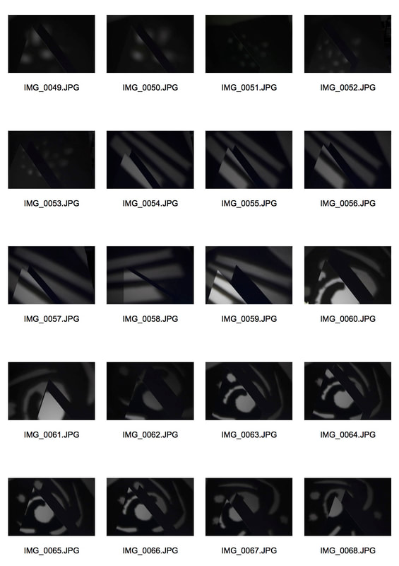
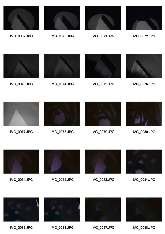
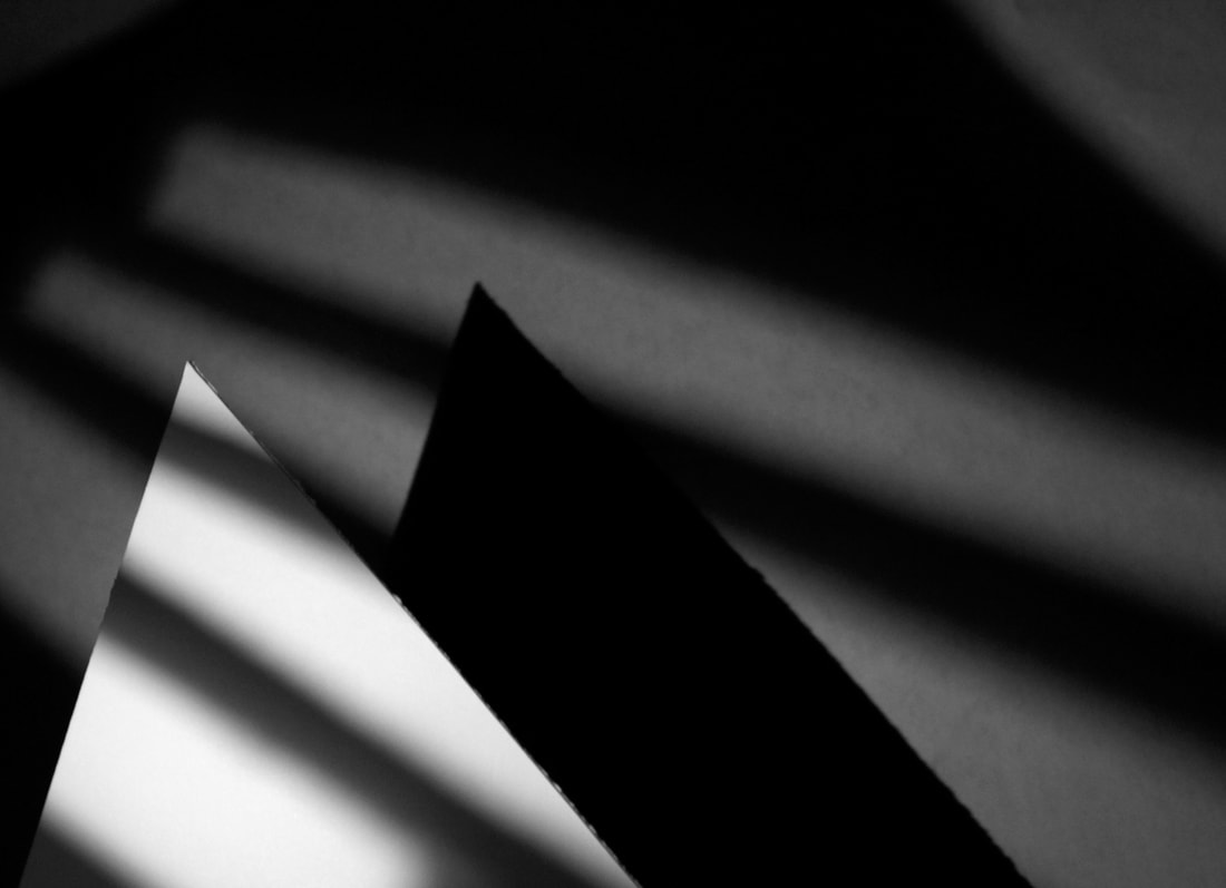
My response
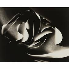
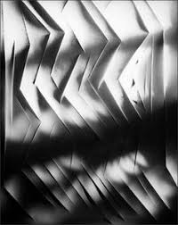
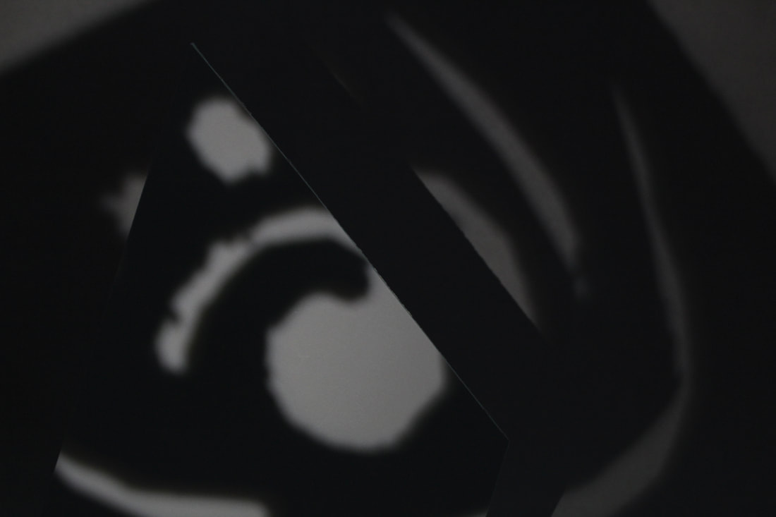
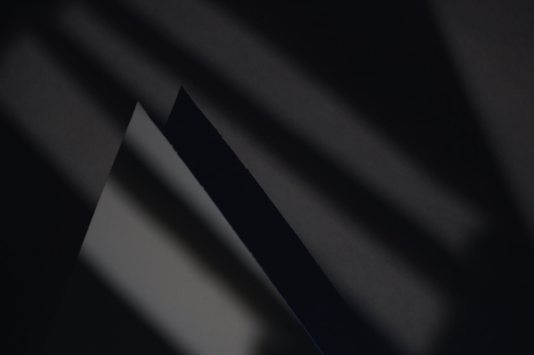
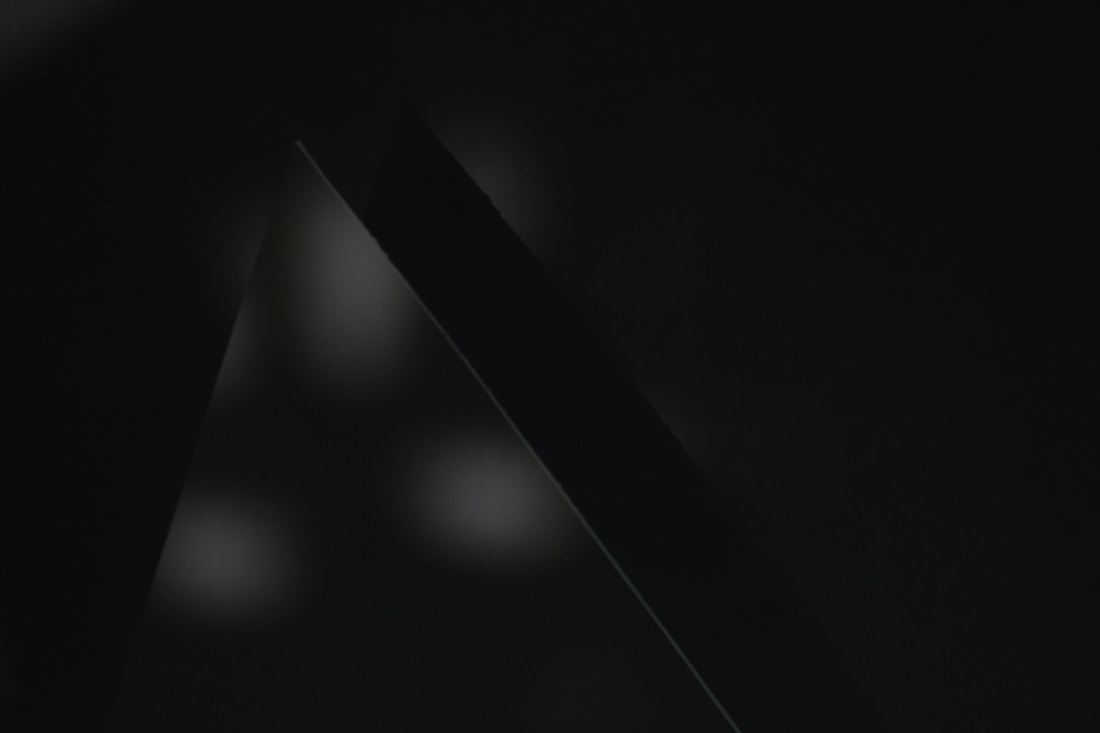
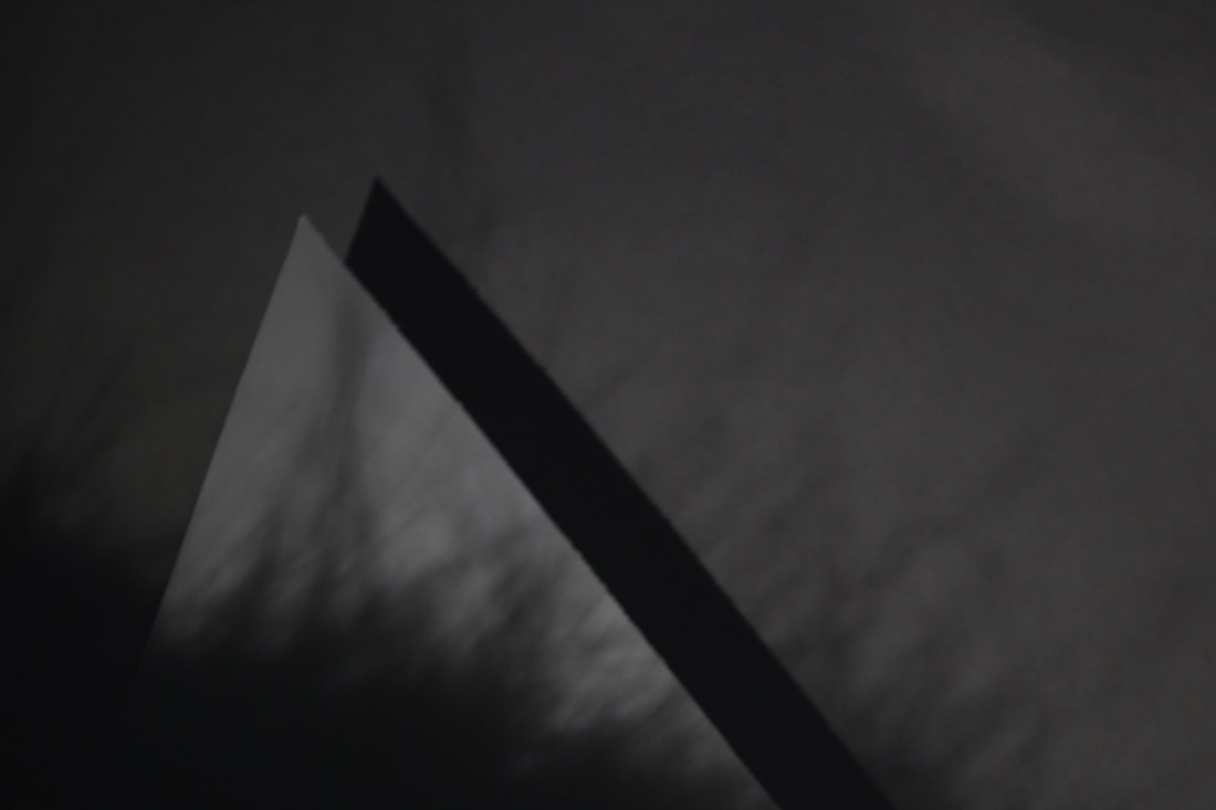
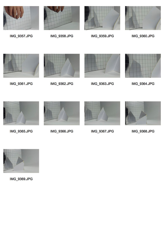
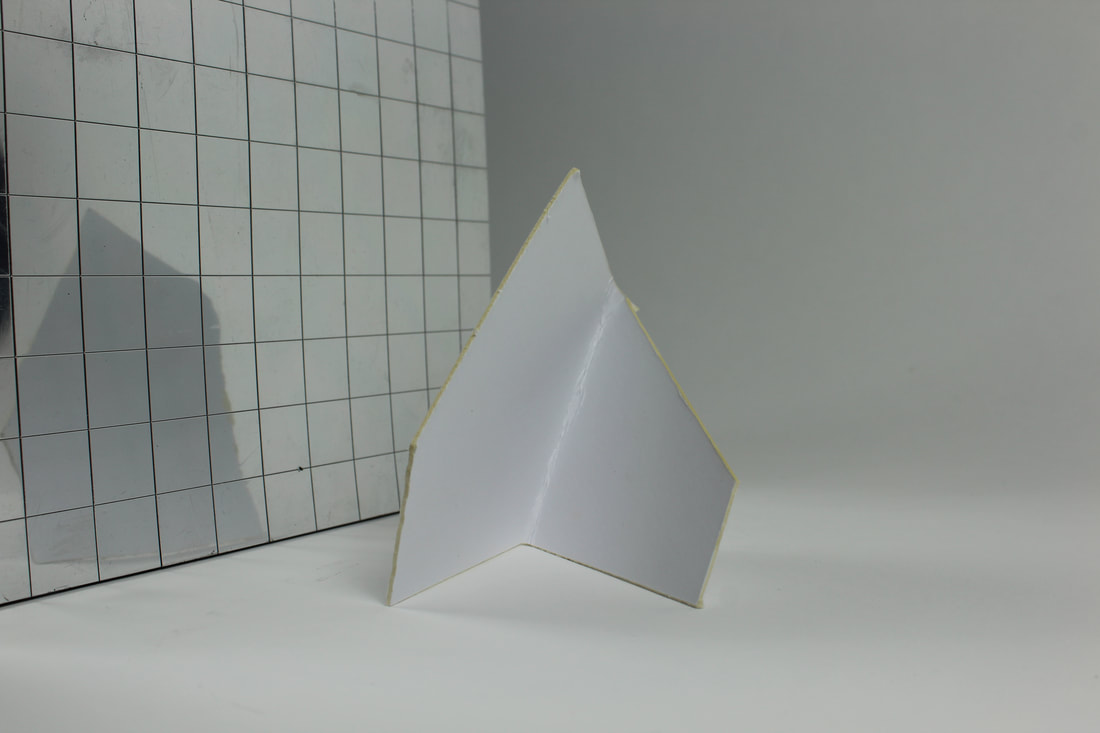
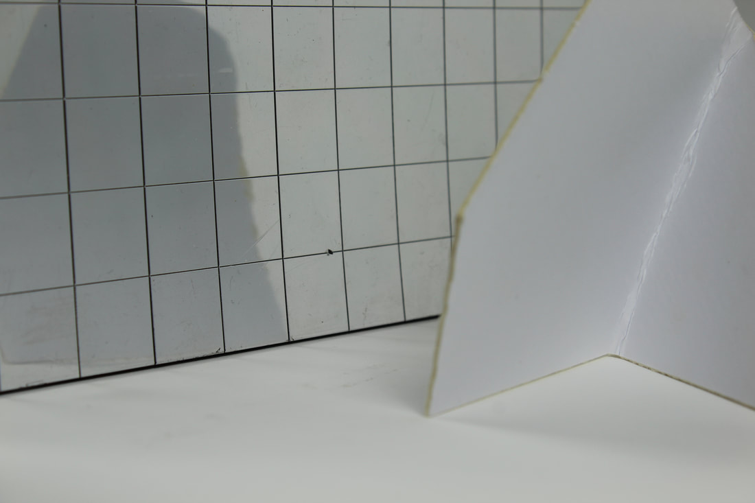
For my response, I used a piece of card that had a pointed edge to create a triangular shape and used stencils made from paper and card to shine light onto the card. I also used the fur in my coat to create a more soft shadow.
|
|
|
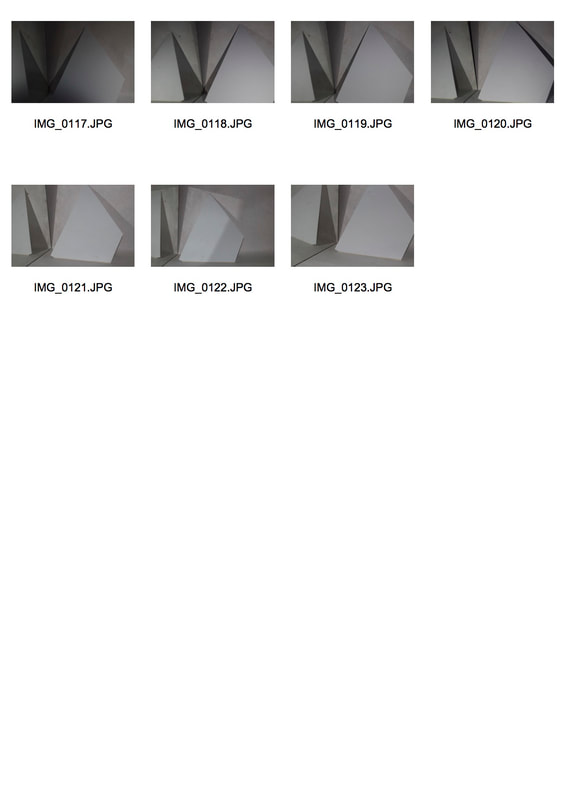
|
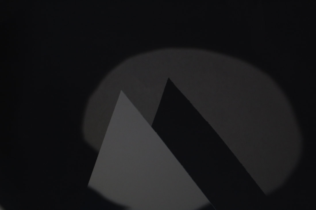
|
|
|
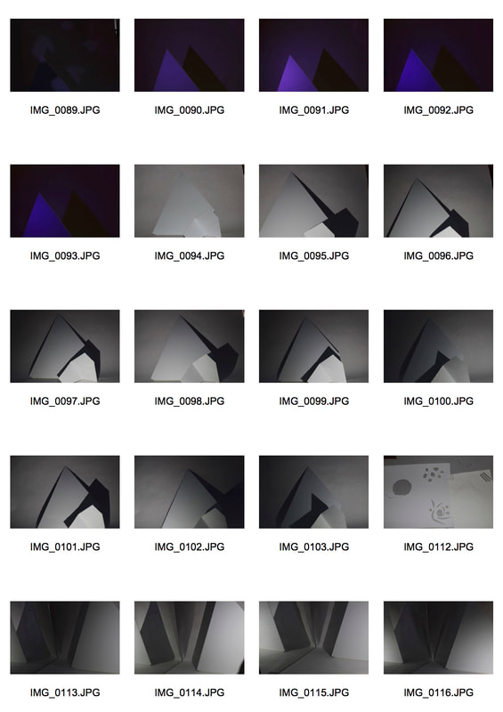
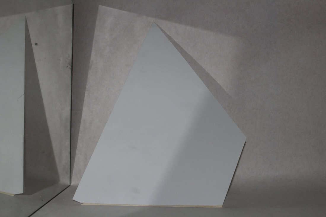
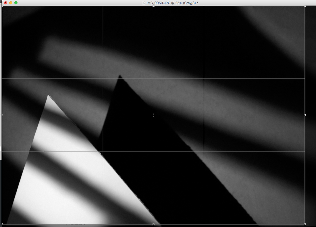
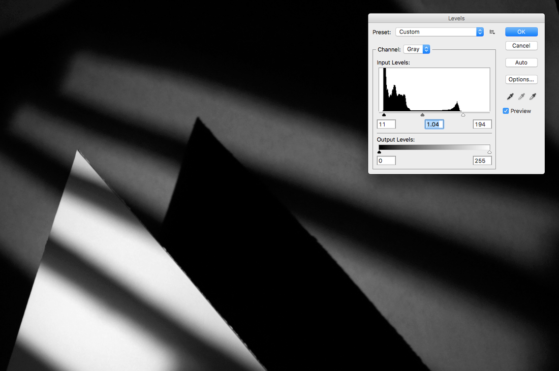
My edited response
I edited my photos on photoshop so the original piece of card was slightly more visible but keeping the shadows on it. I made the photo black and white first to remove and yellow tones so it was easier to edit. I then used the levels tool to light the card so it was more visible and darkened the shadows. Then I cropped the photos so the card was the main focus.
|
|
THREE STRANDS
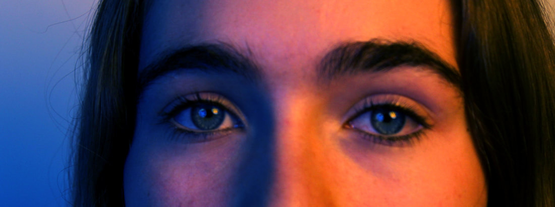
STRAND 1: Coloured locations
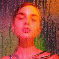
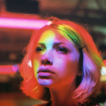
TOBY HARVARD
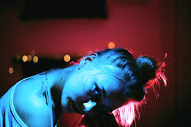
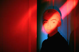
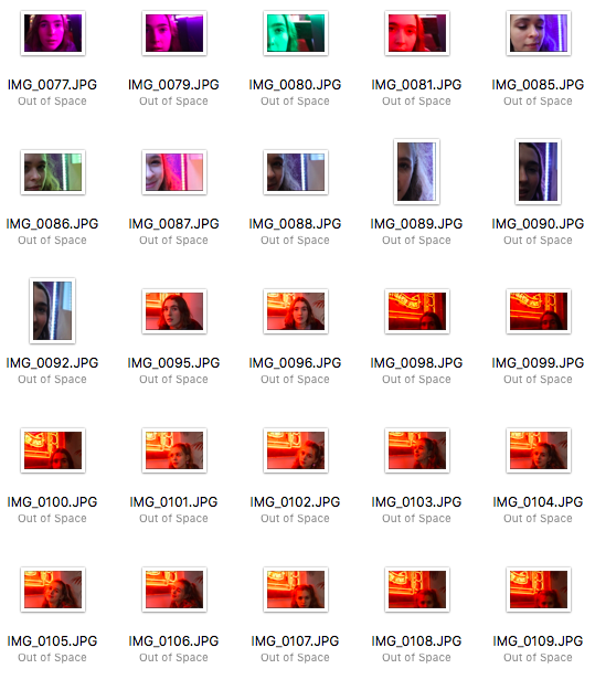
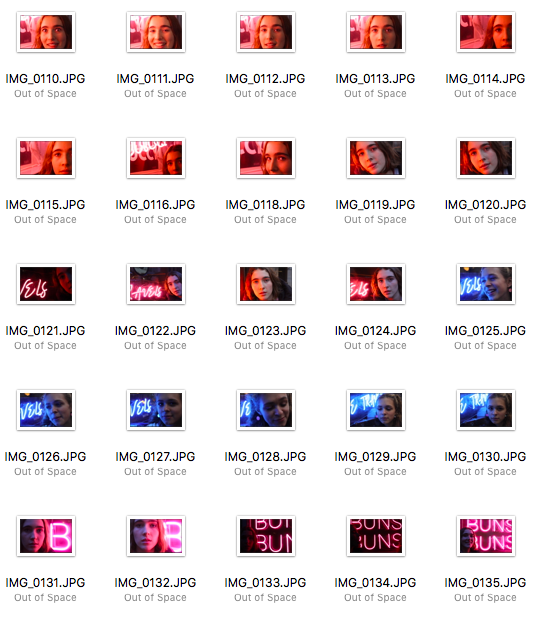
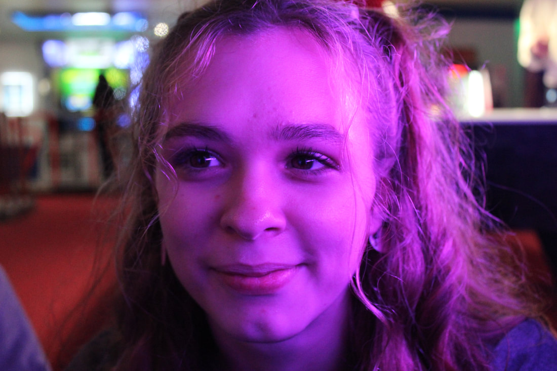
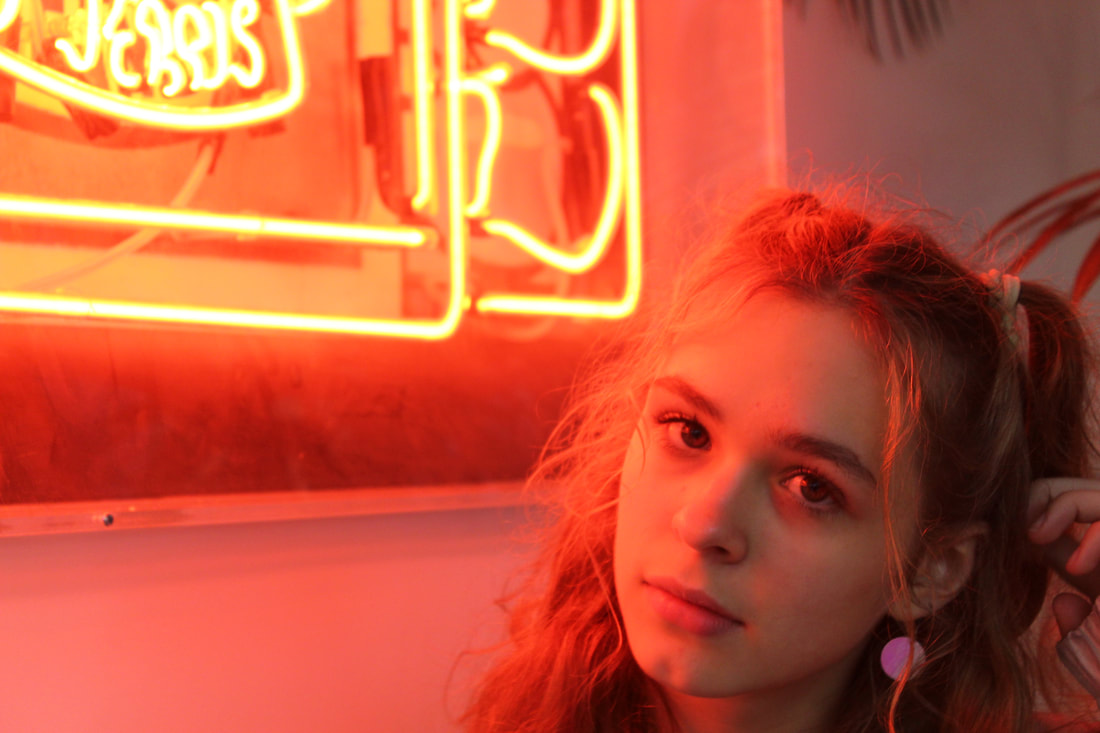
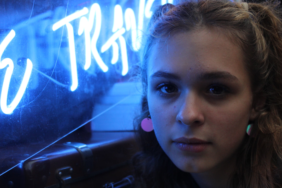
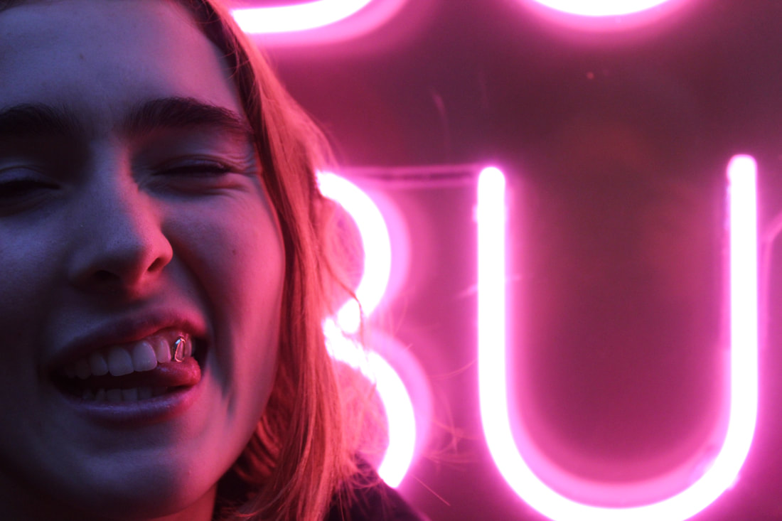
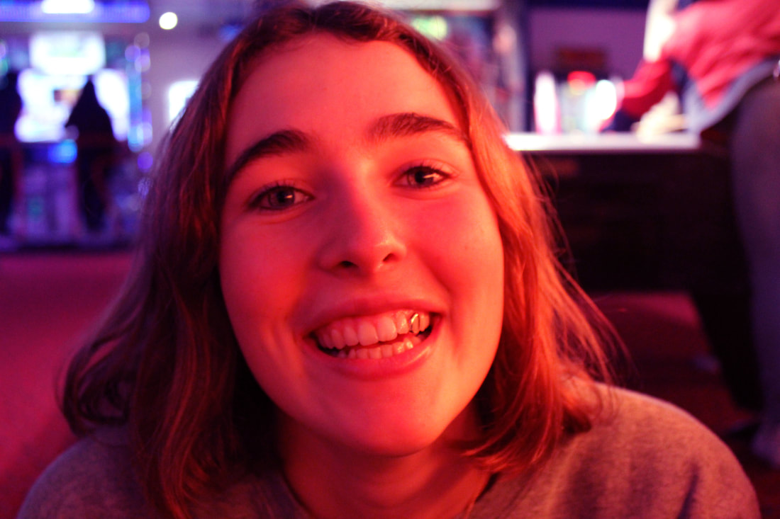
Toby Harvard photographs people under neon lights with cheap materials. He calls himself a "fetish photographer" and has an unconventional view on photography. He enjoys photographing pictures from the side or the back so he doesn't reveal too much of the subject, "it creates wonder". Harvard mostly photographs his photos in New York, Hong Kong or other places with atmosphere that he feels compliments his work.
|
|
|
|
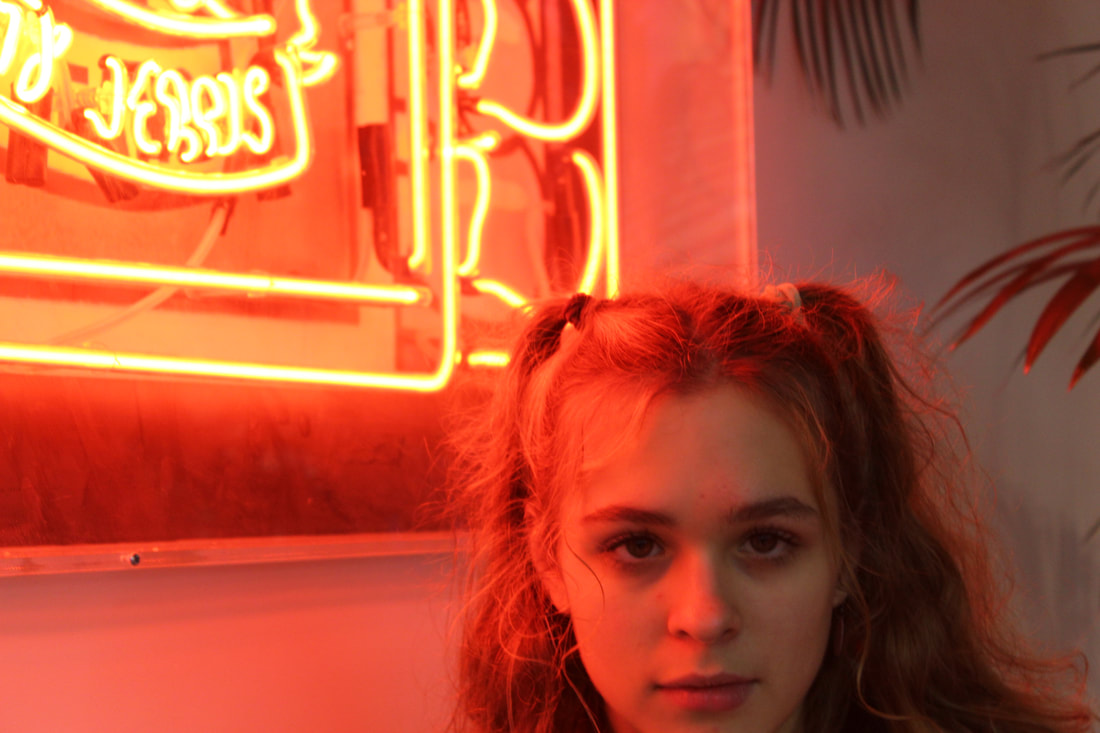
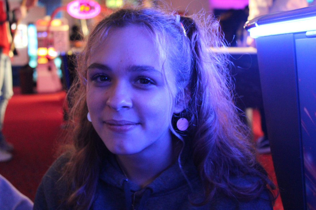
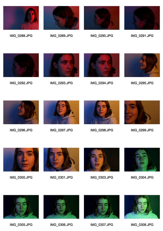
As a response to Harvard I went to Soho to an arcade and outside any shops that had neon lights to get these photos. I liked the way these turned out as for most of them, the effect of the neon light was really strong. I wish I could have found a place that had two toned lights so there could be more than one light in the photo.
|
|
|
|

|
|
|
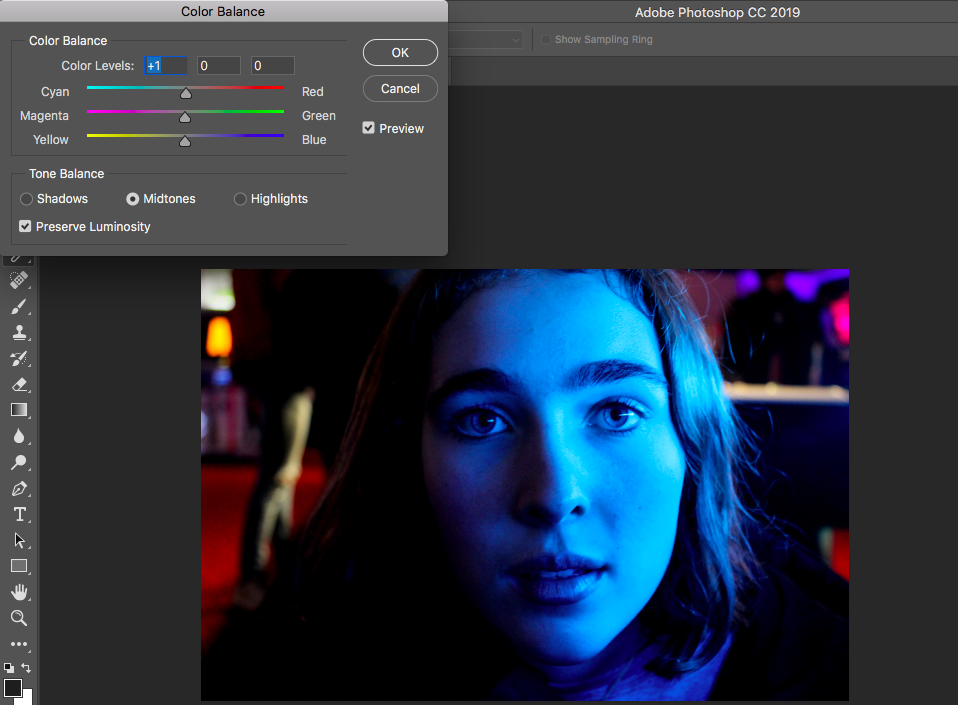
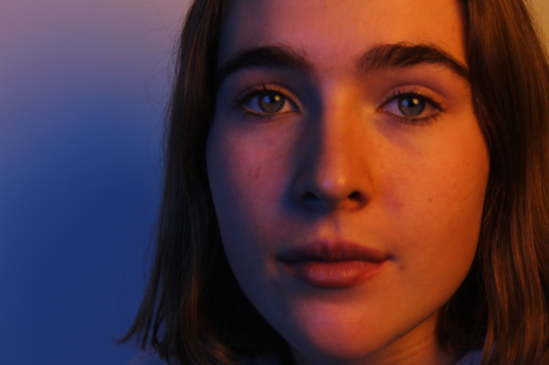
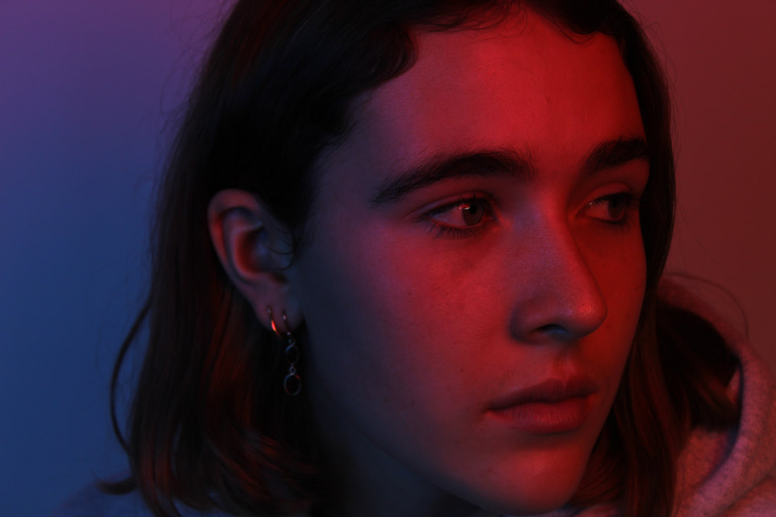
My Edited Response
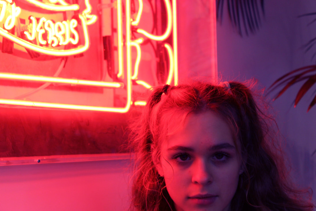
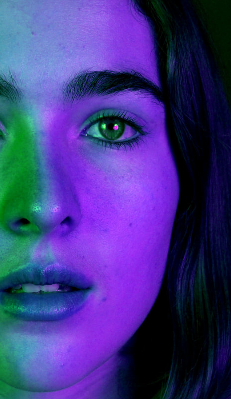
I used photoshop to intensify the hues so the effect of the colour was more extreme. I was able to use a tool that added hues so I could change an entirely blue photo to have red light as well which then achieved the toned portraits I wanted. I also darkened the background on some so the focus of the photo was just the face. To gain this same portrait I also the cropped the photos so it was just the face, in doing this, you lose the visible light source so the colour is just purely on the face.
EDIT 1
|
|
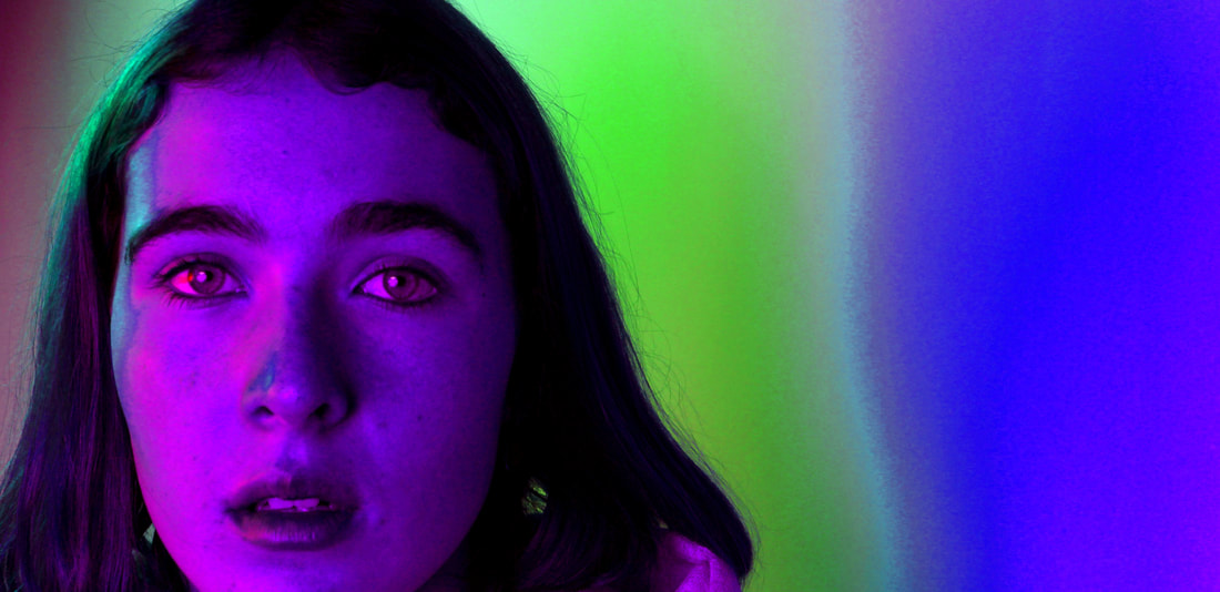
These are some more edited colour portraits I created using the same tools.
|
|
|
|
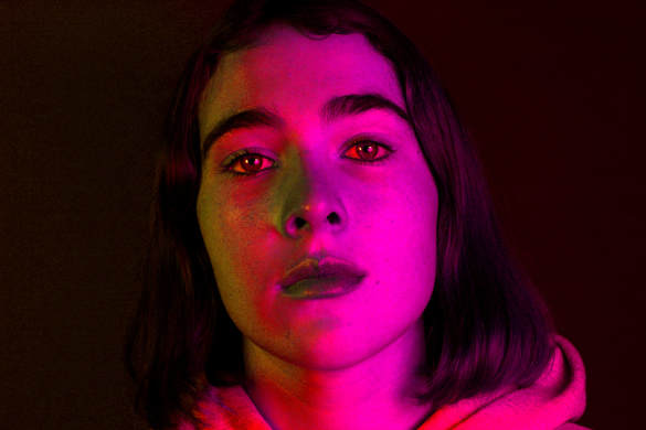
These portraits worked best when using the colours red and blue as those colours came out the strongest.
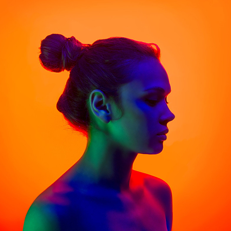
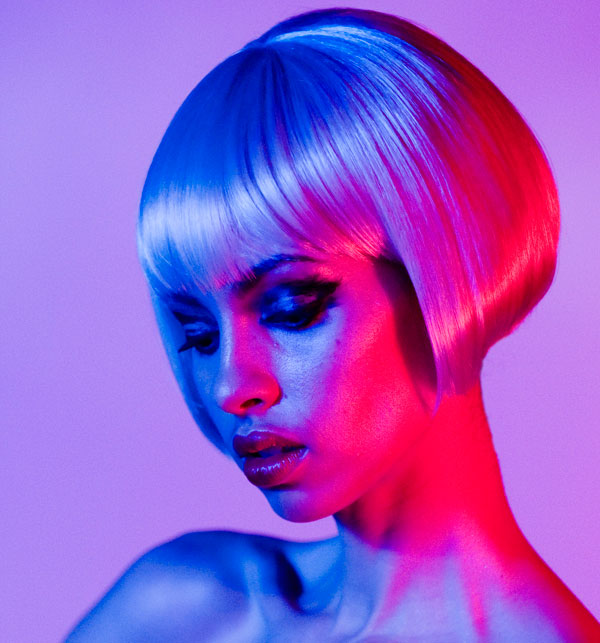
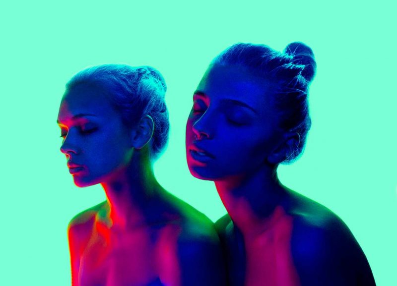
STRAND 2: Coloured lights on people
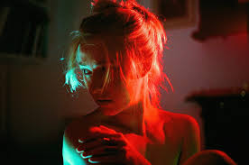
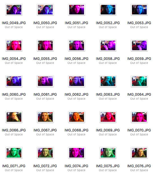
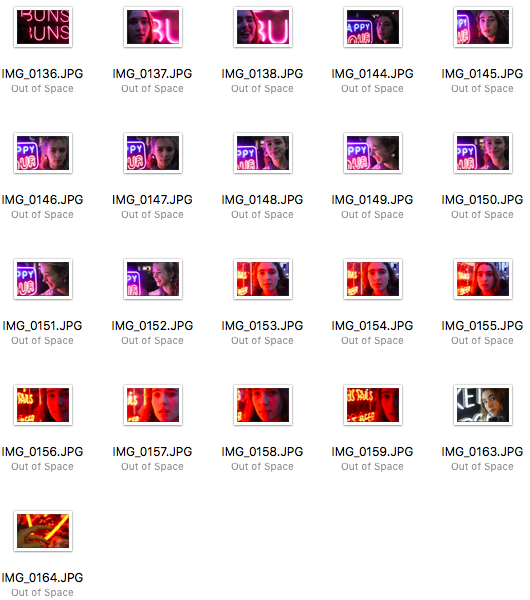
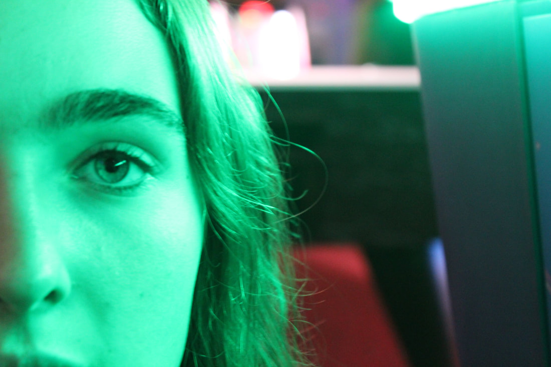
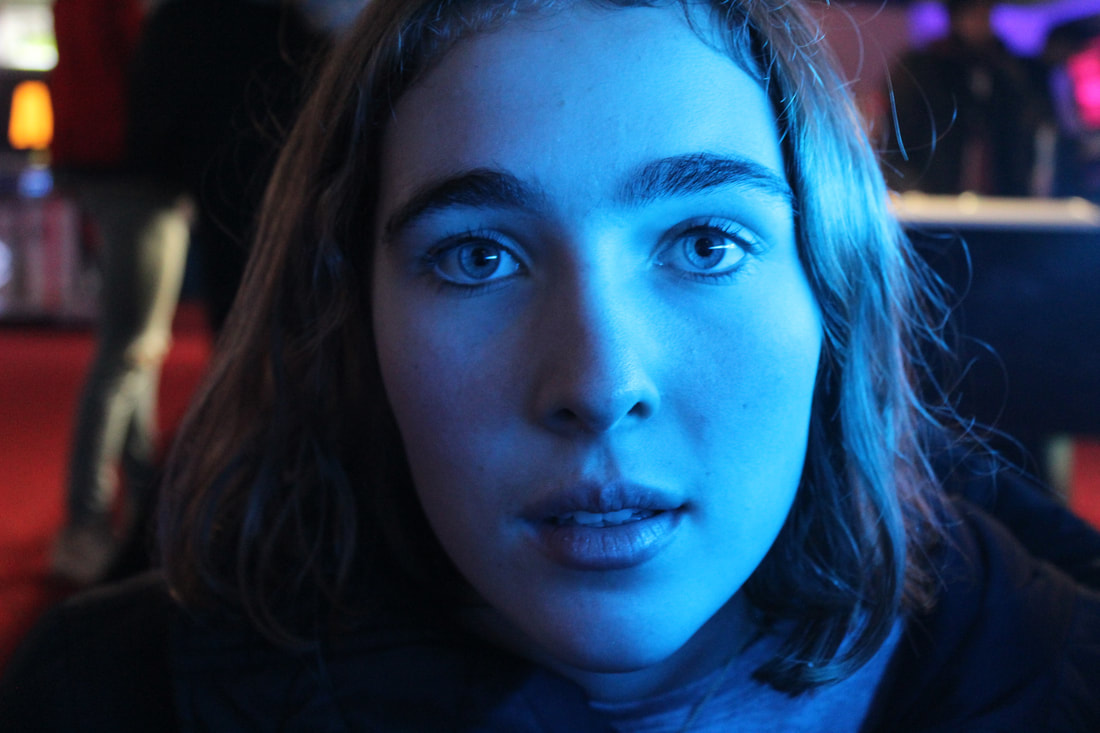
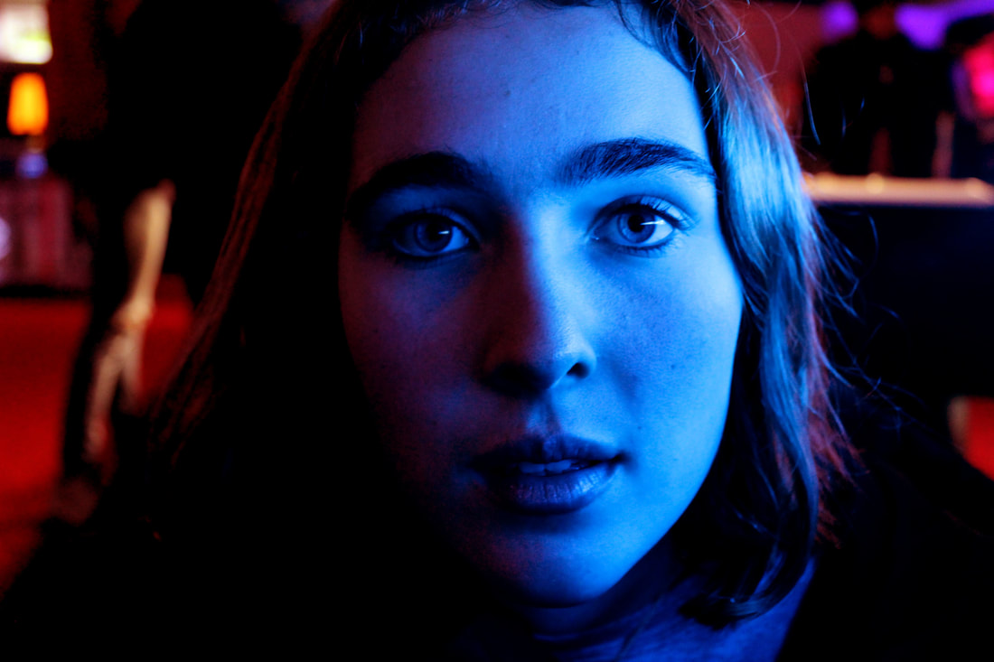
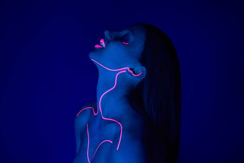
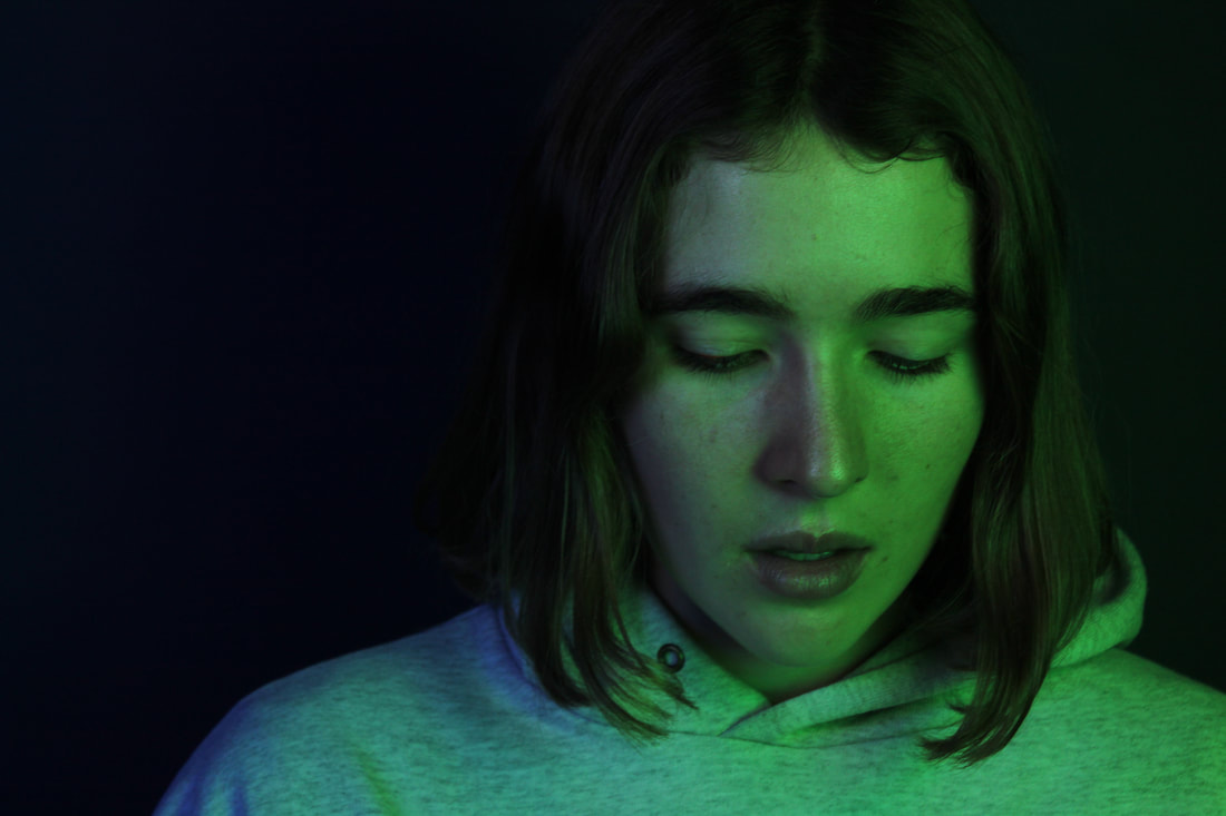
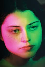
Strand 2 development: SLAVA SEMENYUTA
Semenyuta is a self taught photographer and illustrator from Russia. He uses coloured lights and neon body paint to create his 'cosmic' looking portraits. His portraits focus on the lights and effect of the photo so I want to capture a similar result using these resources.
|
|
|
|
I am going to use the studio lights and coloured sheets over the bulbs to create these colours. I will also use some UV paint to paint along the natural lines of the body to create a similar look to the last photo, by using a UV light I can create the same glowing effect.
MY RESPONSE
|
|
|
|
|
|
|
|
Edited photos
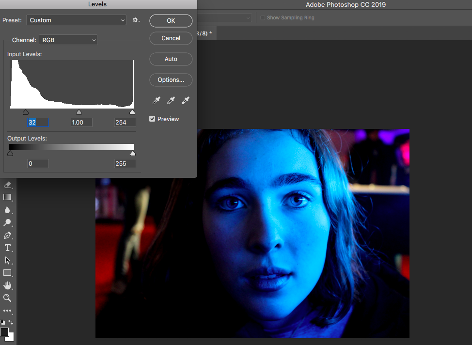
I edited these photos in photoshop by changing the levels making the colours more intense and to darken parts of the photo. I then cropped them focus none smaller portions of the colour.
|
|
Strand 2 development: PETRA COLLINS
Petra Collins is an artist living in New York, originally from Canada. Her photography is know or being dreamy and feminine with soft and colourful lights. She has directed many music videos and short films. She has also photographed campaigns for Nordstrom and Gucci. She went to Rosedale Heights School of the Arts when she was 15 which was when she started photography. She is currently attending the Ontario College of Art and Design. She has curated and featured in over a dozen shows since 2011 all over the USA. I like her work as it focuses heavily on the coloured portraits like the other artists I have researched and responded to.
|
|
|
|
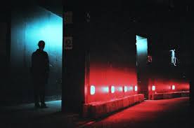
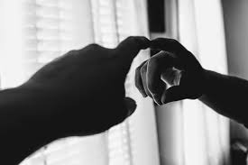
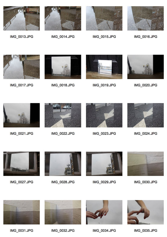
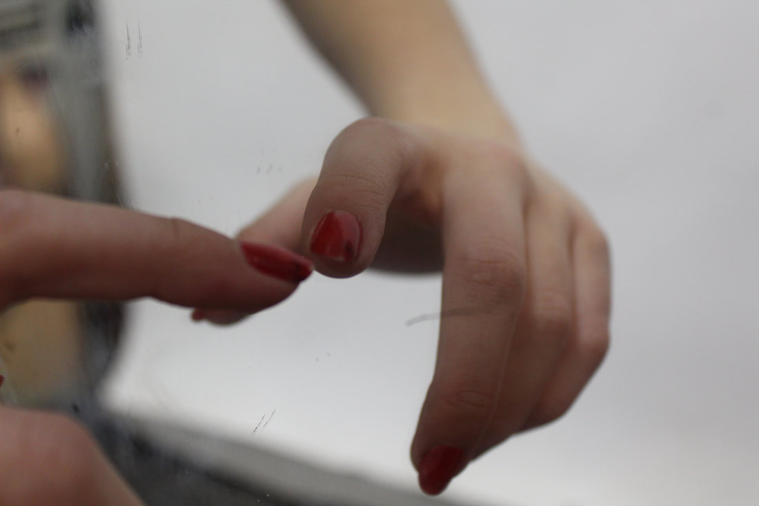
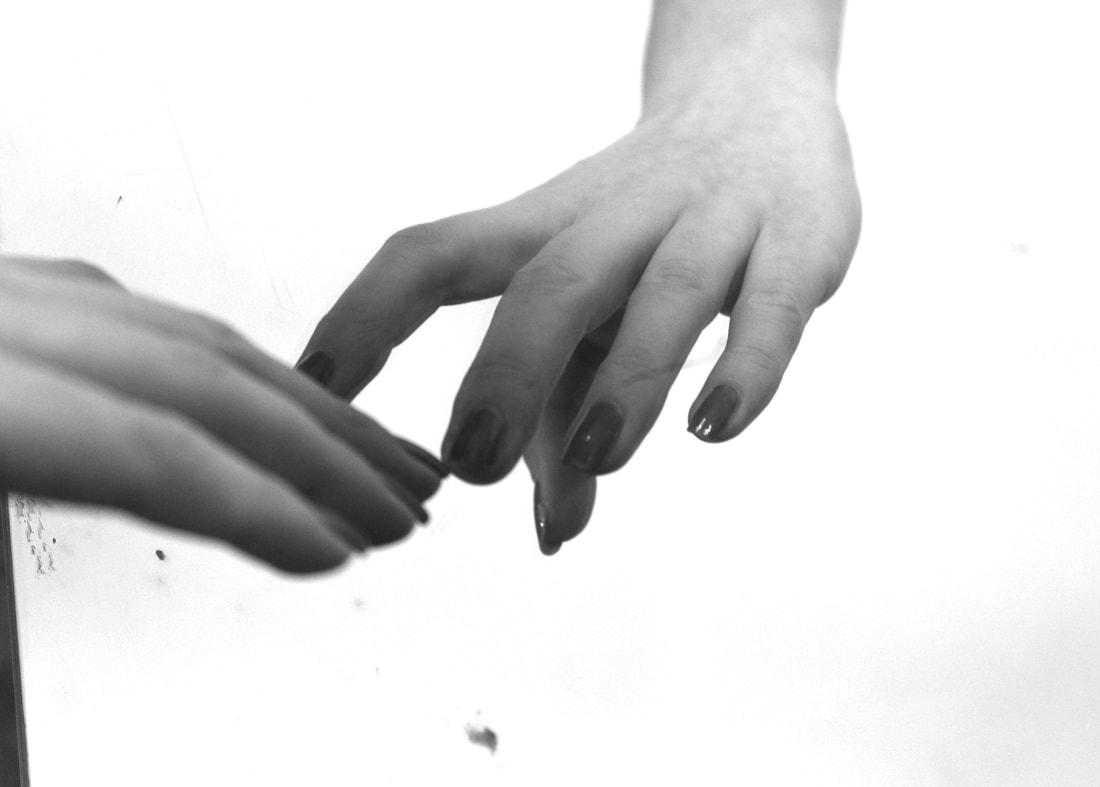
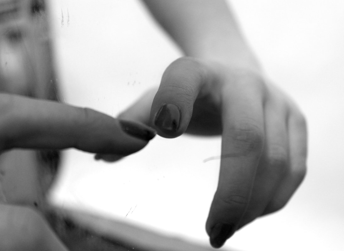
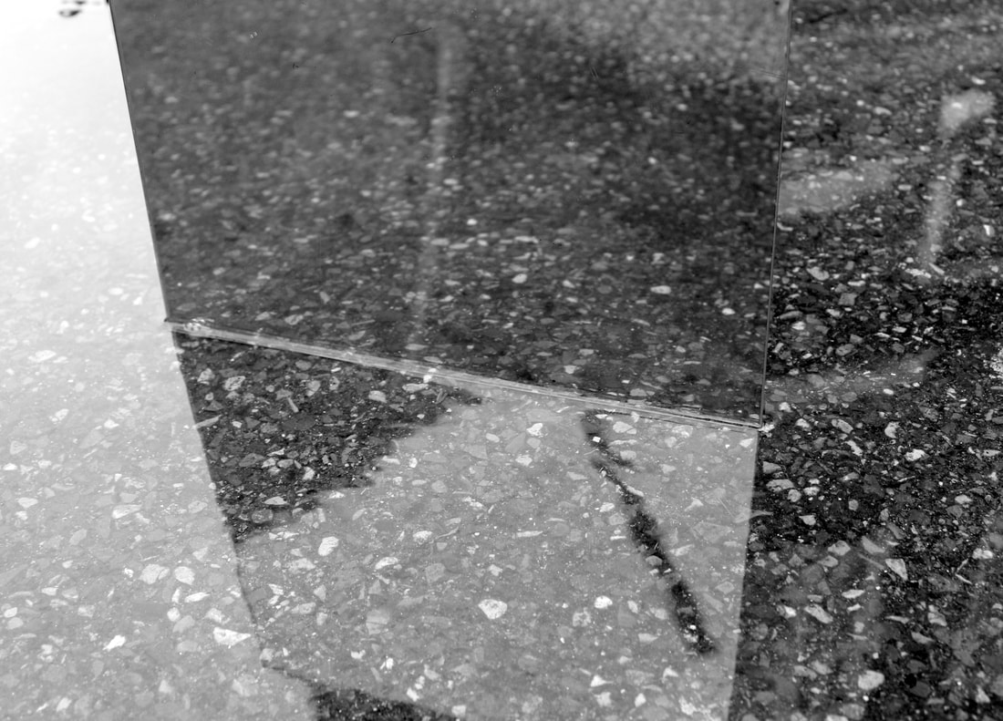
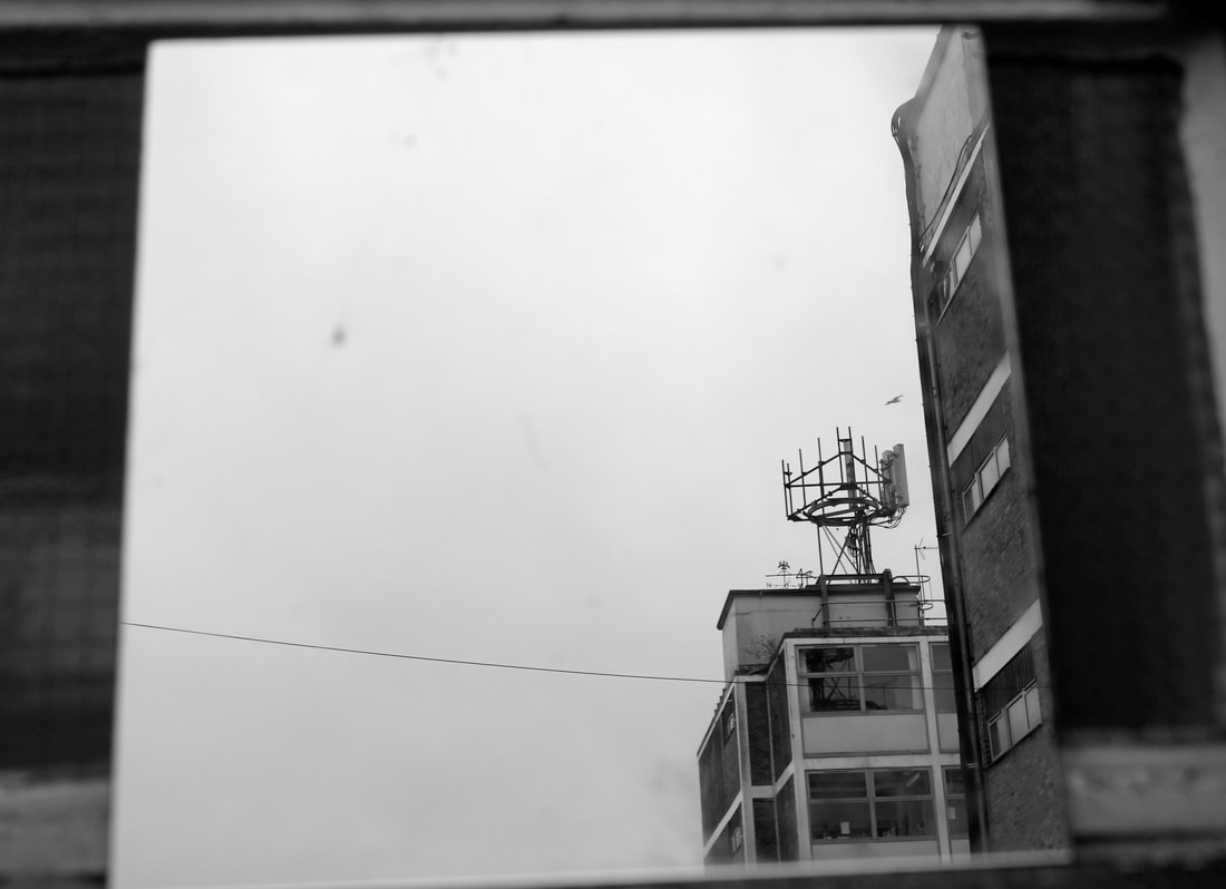
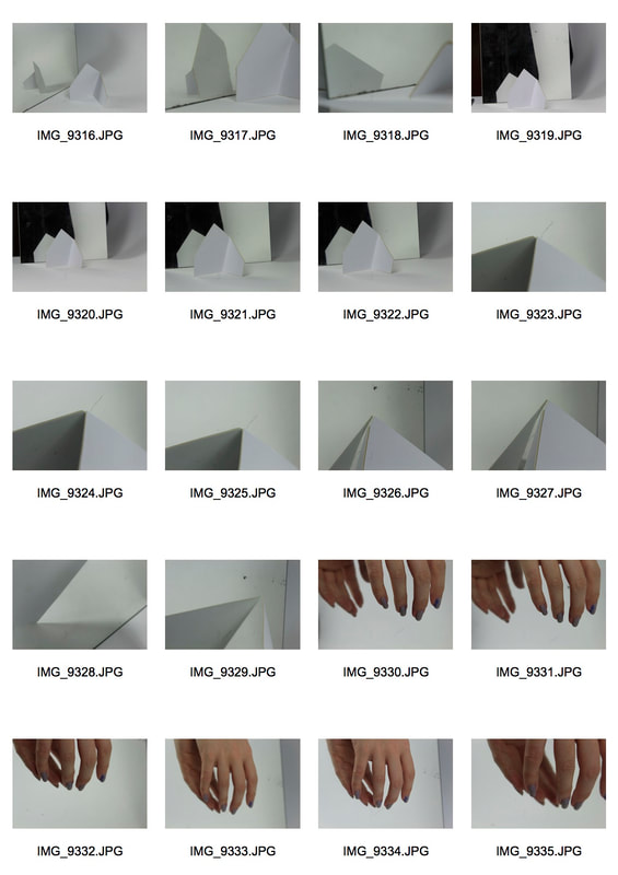
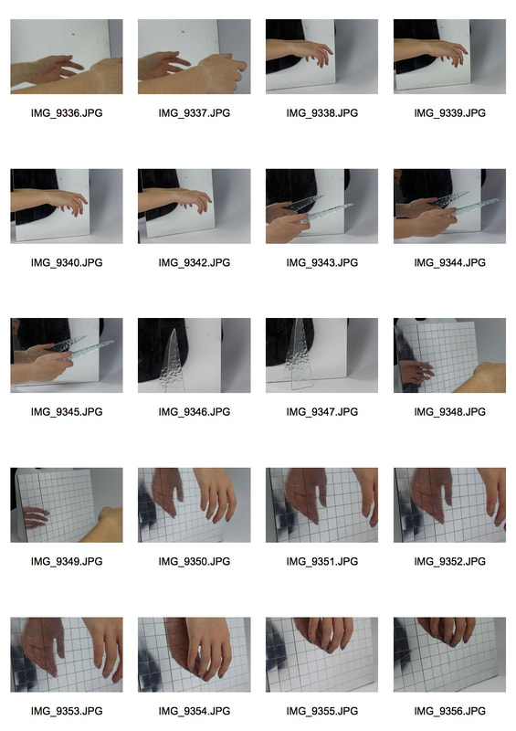
Strand 3: Mirrors and Reflections
|
|
|
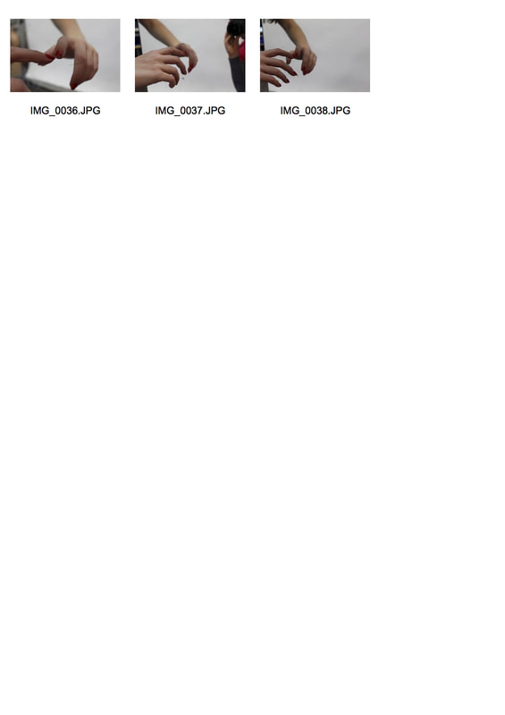
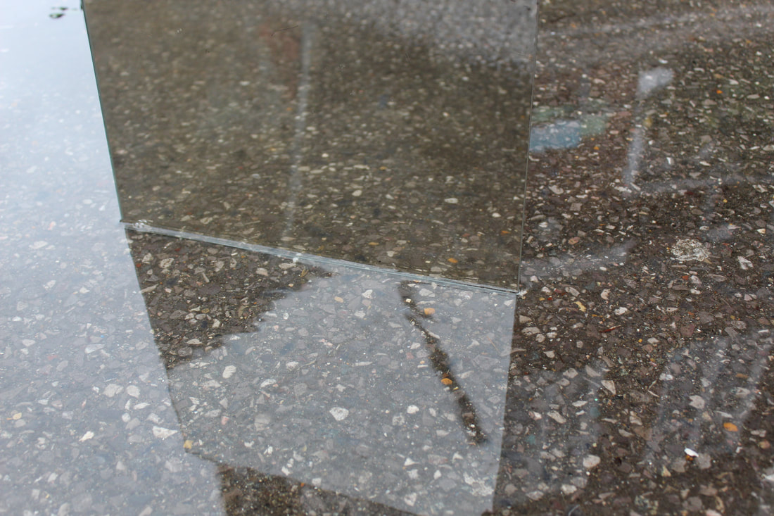
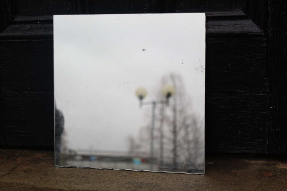
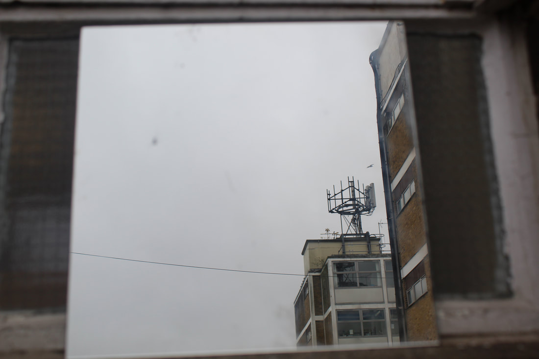
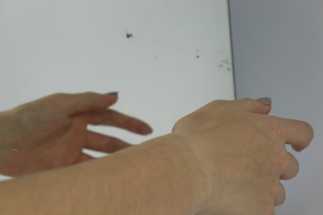
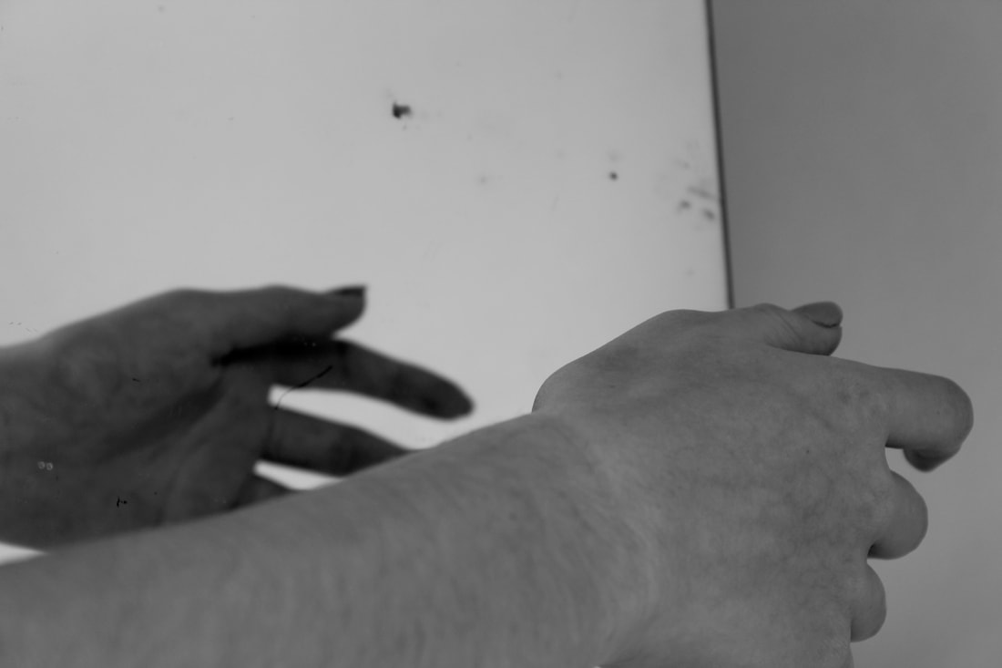
To photograph for this strand, I am going to photograph in the studio with a mirror using my hands and paper to create patterns and reflections. I will also take a mirror out with me so I can photograph in an urban area using street lights, water and people to create multi dimensional photos within the mirror.
My first responses
These photos aren't a response to an artist they were just to first experiment with this strand, I went around school with a mirror and photographed it in different locations sometimes focusing on the placement of the mirror and also focusing on what the reflection was. I am going to take more photos in different types of locations.
|
|
|
|
Edited photos
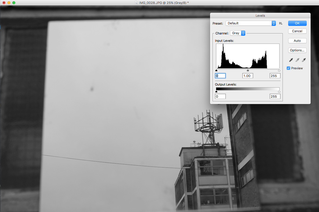
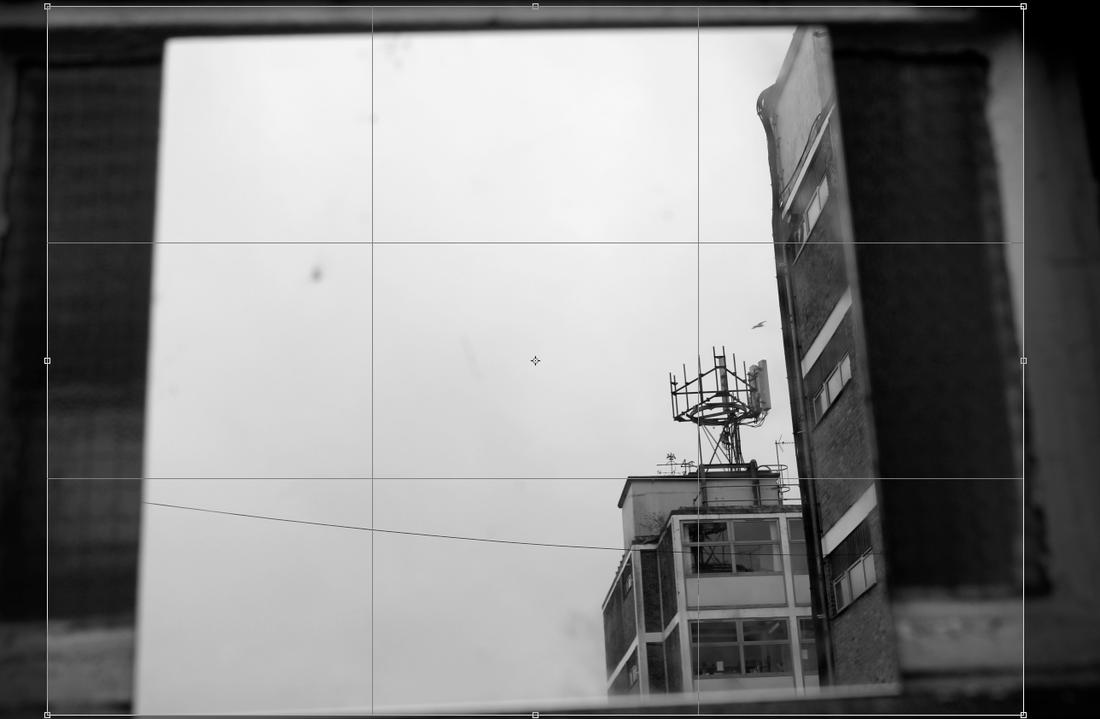
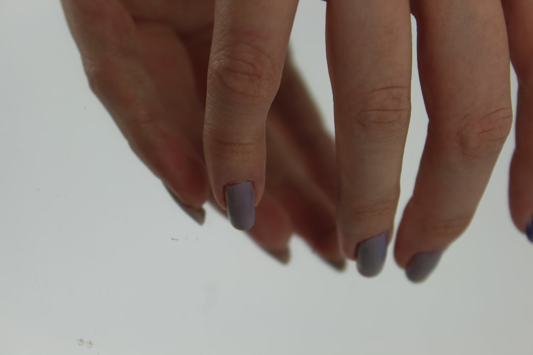
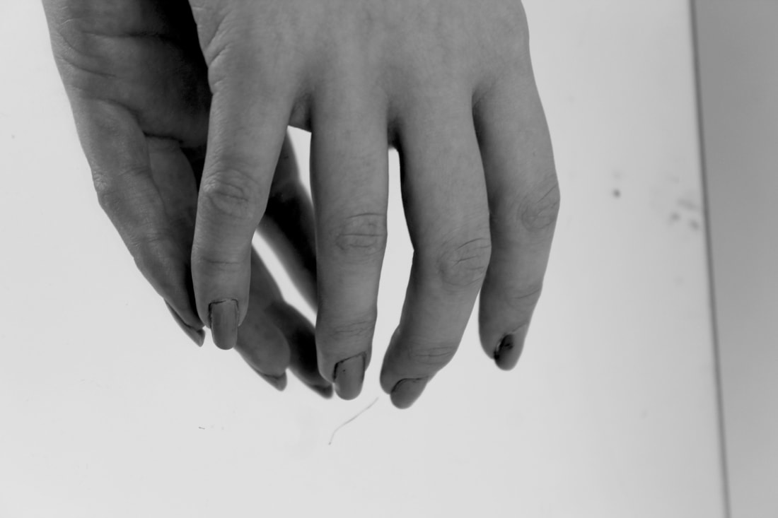
I edited the photos so they were black and white and cropped the photos of the hands so they were more focused on the hands. I first changed the mode so the photo was grayscale. Then I changed the levels by raising the white and black bars, creating a more defined and sharp image. It is hard to gain complete focus when photographing hands in a mirror as the camera doesn't focus perfectly on both sides of the mirror.
|
|
Final Edits
|
|
|
|
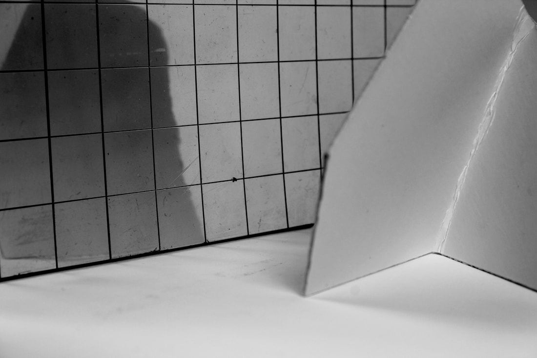
These are some more photos I took in the studio to look more at the hands and at different mirror surfaces.
|
|
|
|
|
I edited these photos in the same way as the last ones.
|
|
Strand 2 development: Line experimentation
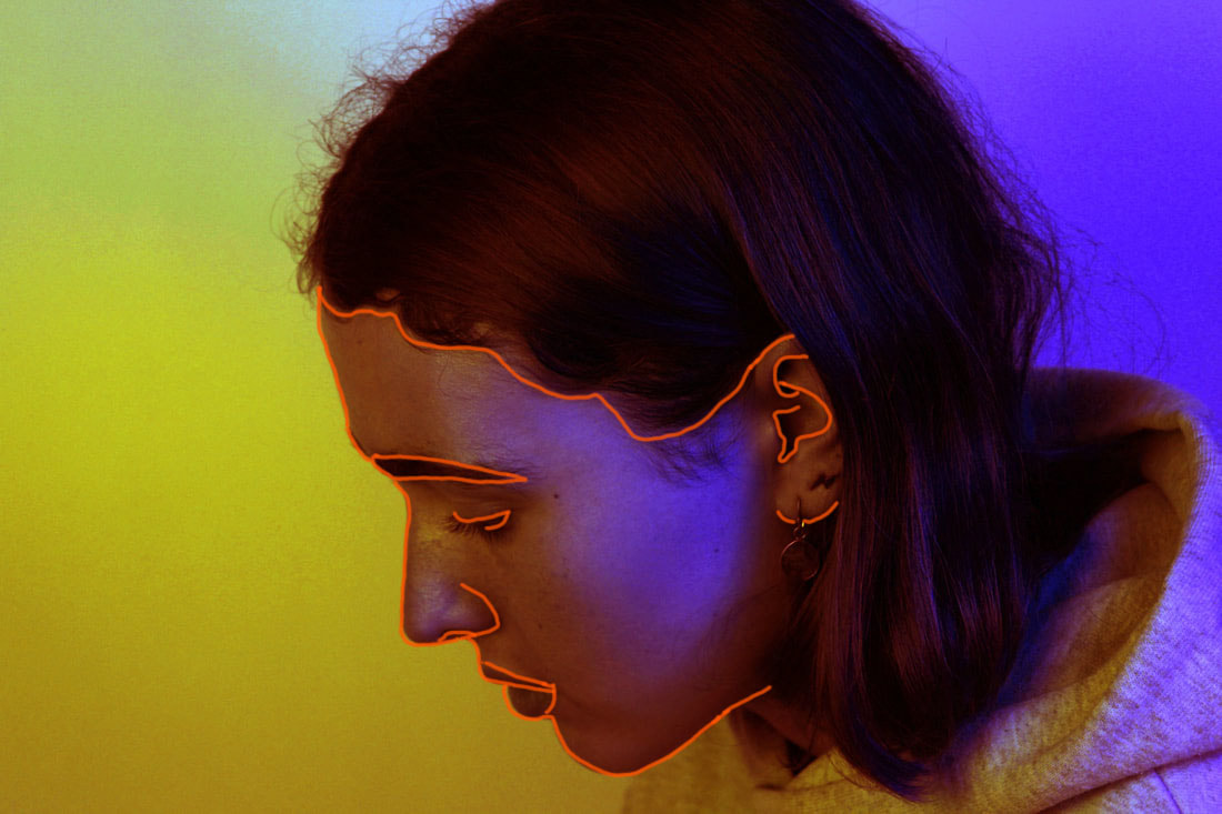
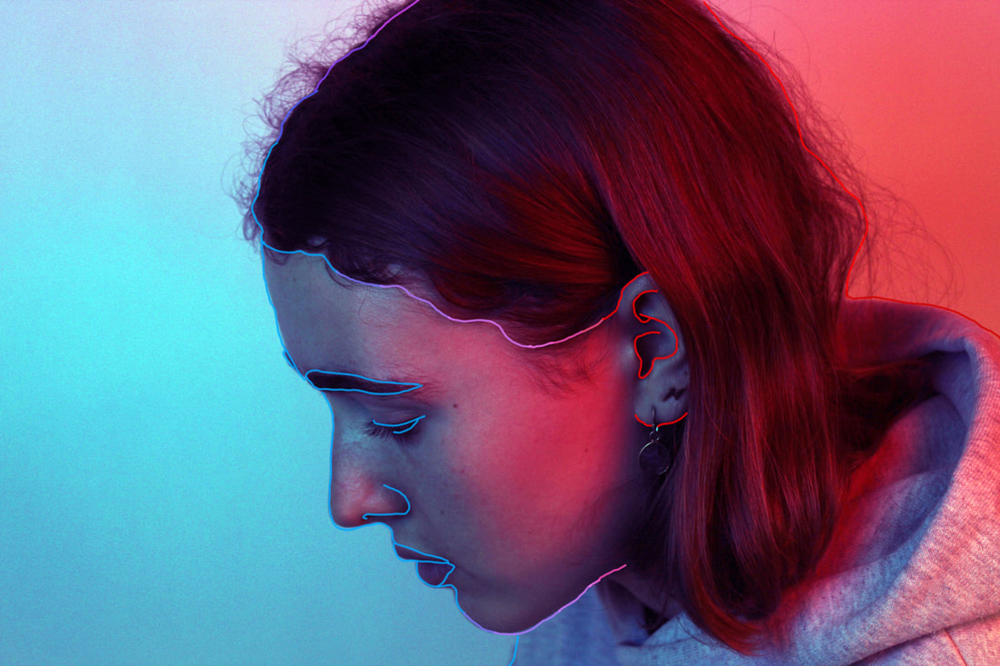
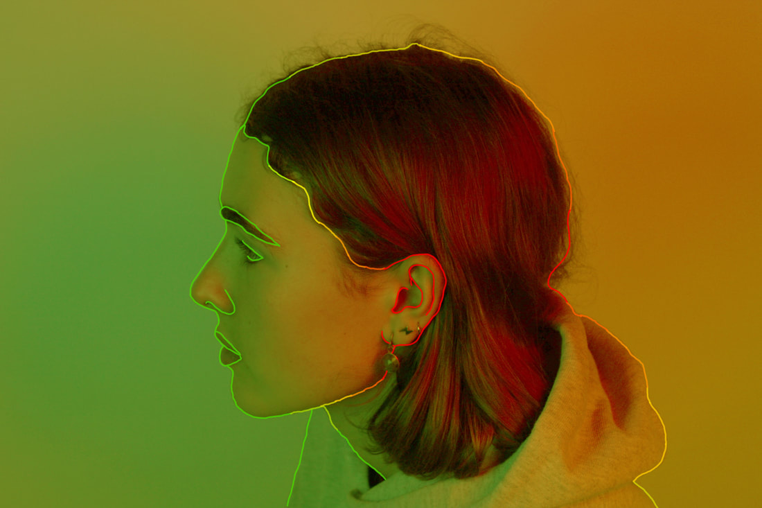
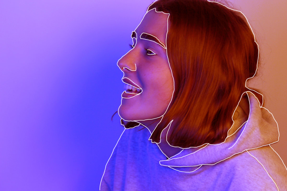
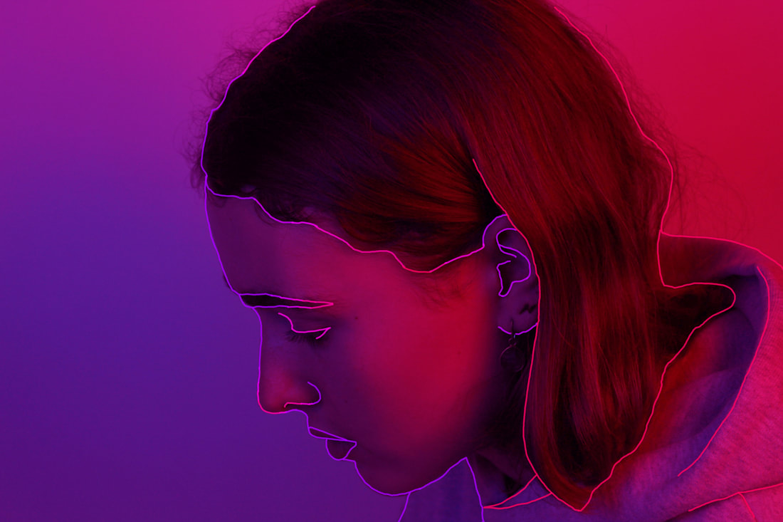
For my final piece I want to take the photos Ive taken under the UV lights and print them off quite big and piece them together in a formation of shapes. After Ive printed them I can draw on them with UV pens and outline the features so when a UV light is shone on the pictures the faces and features stand out. These are some edited versions of my photos which I experimented with to see what this idea would look like.

|
|
I might also just use photoshop to edit the photos so the colours are brighter and then use the brush tool to do the outlines. This means I would have more control over getting the right outlines for the photo. It means if I make mistakes they can be corrected easier. I really like how these turned out but I want to try more body pictures as I would be able to outline the collarbones and jawlines easier.
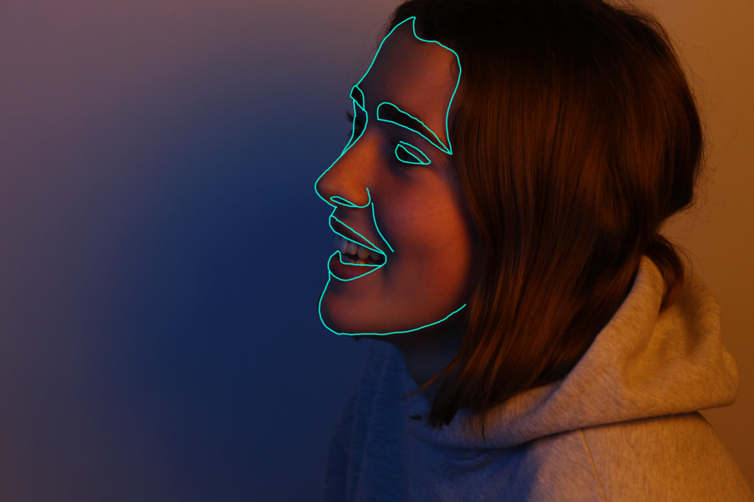
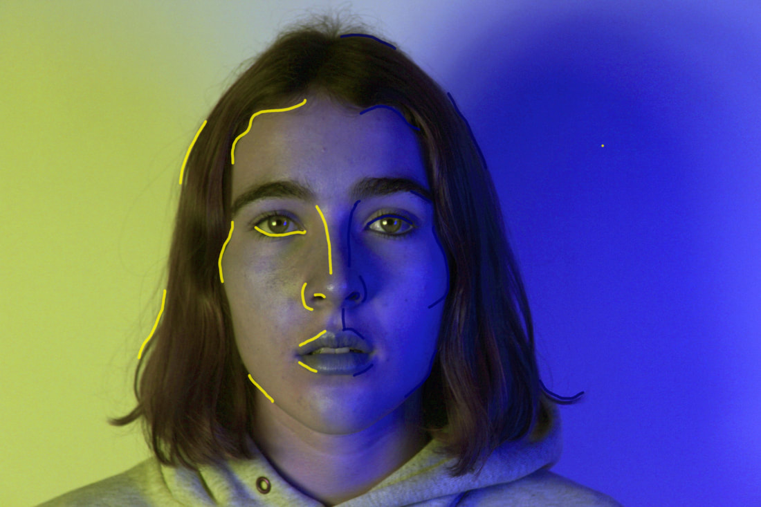
Strand 2 development: Gradients and white lines
So that the lines would blend more with the photo I tried to do a gradient line around the features. I used photoshop and just changed the line colour slightly bit by bit to create the gradient look. I also drew white lines to create the strongest contrast.
Strand 2 development: Gel lights
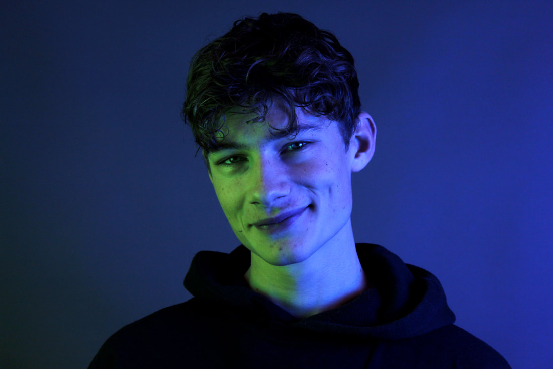
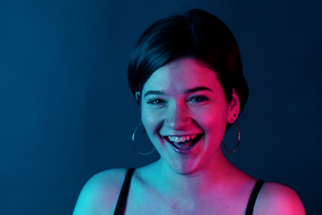
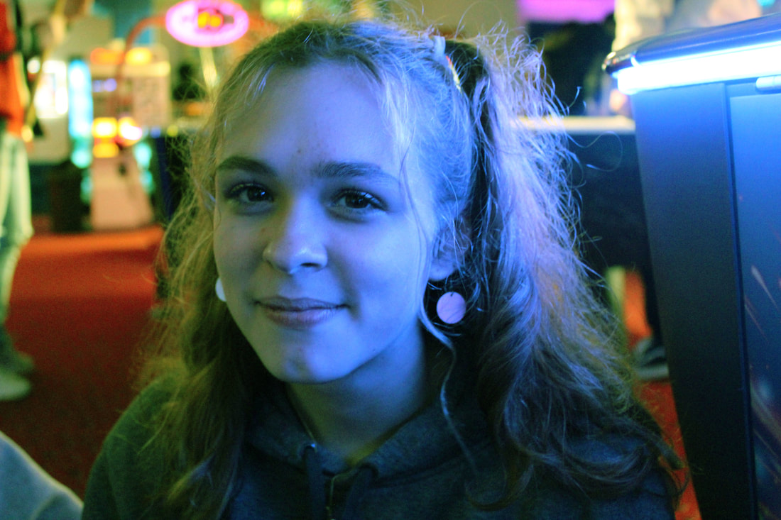
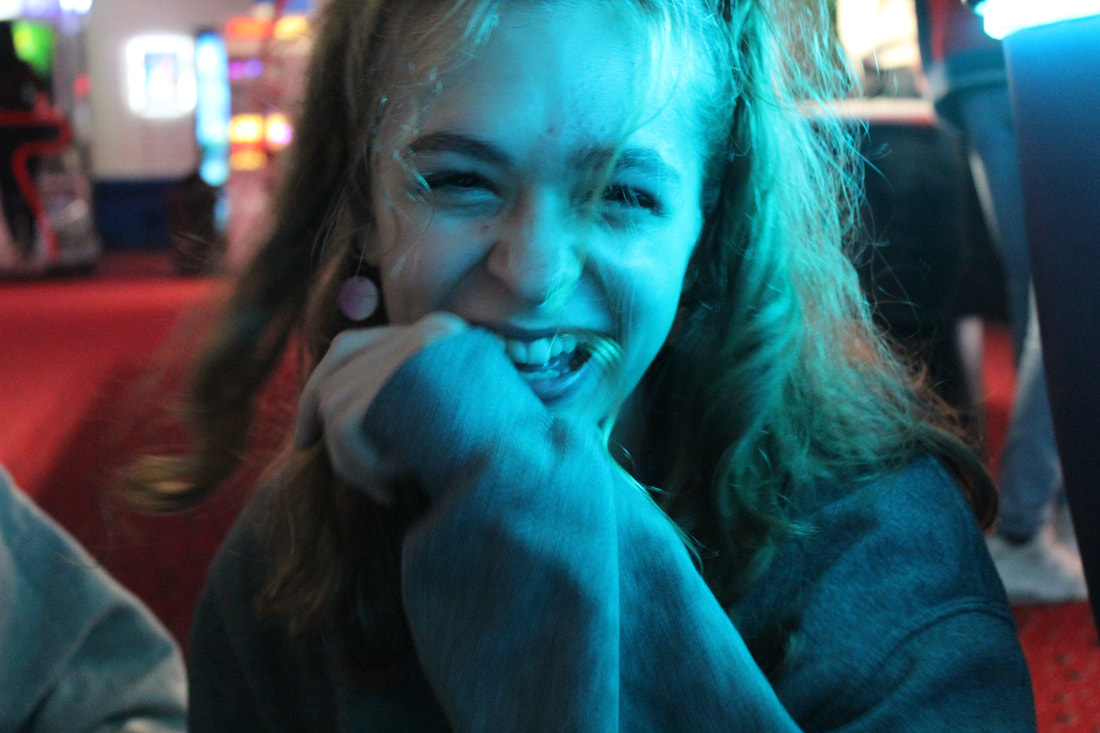
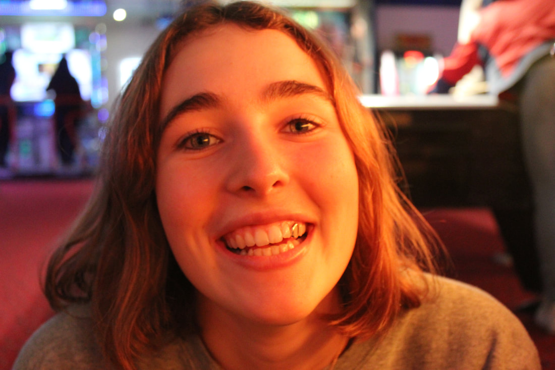
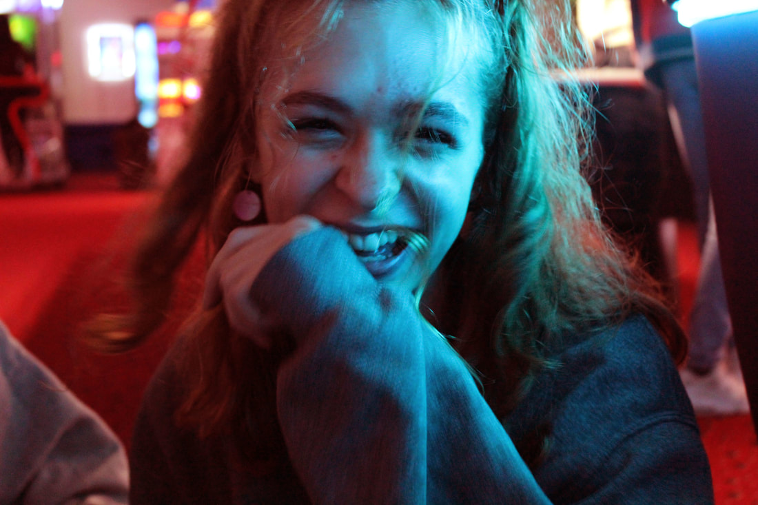
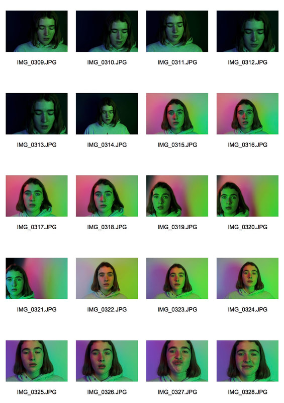
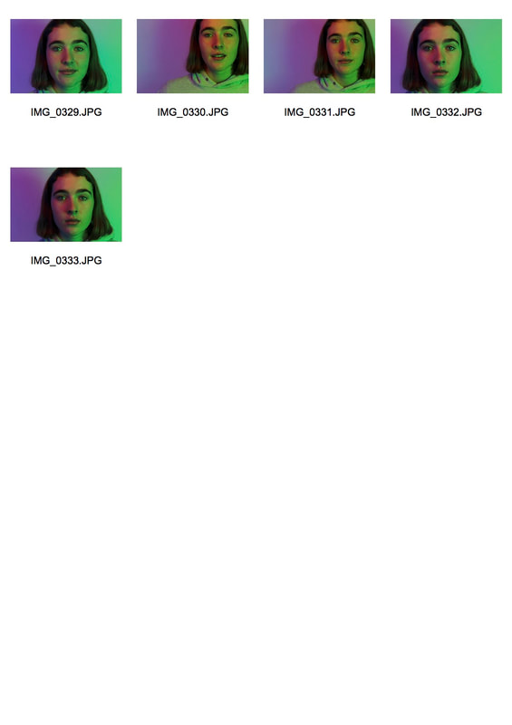
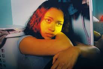
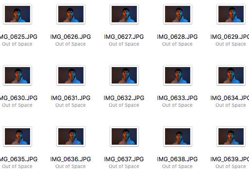
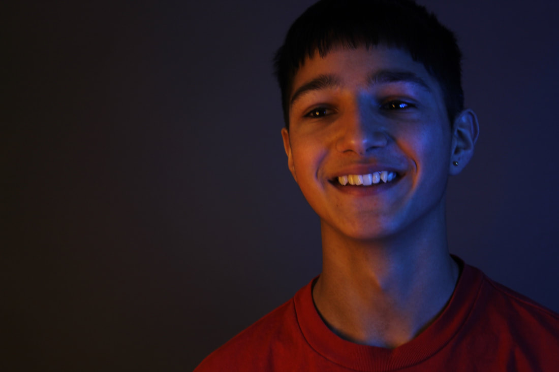
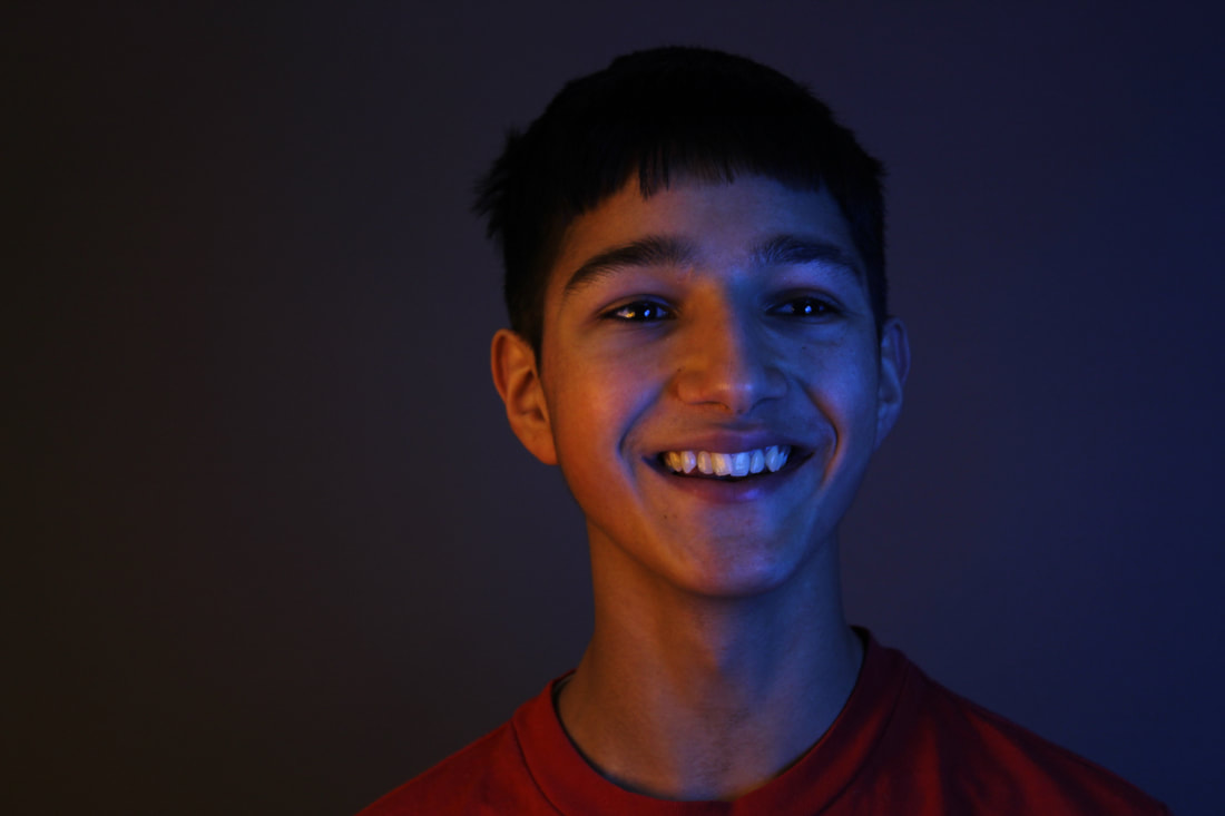
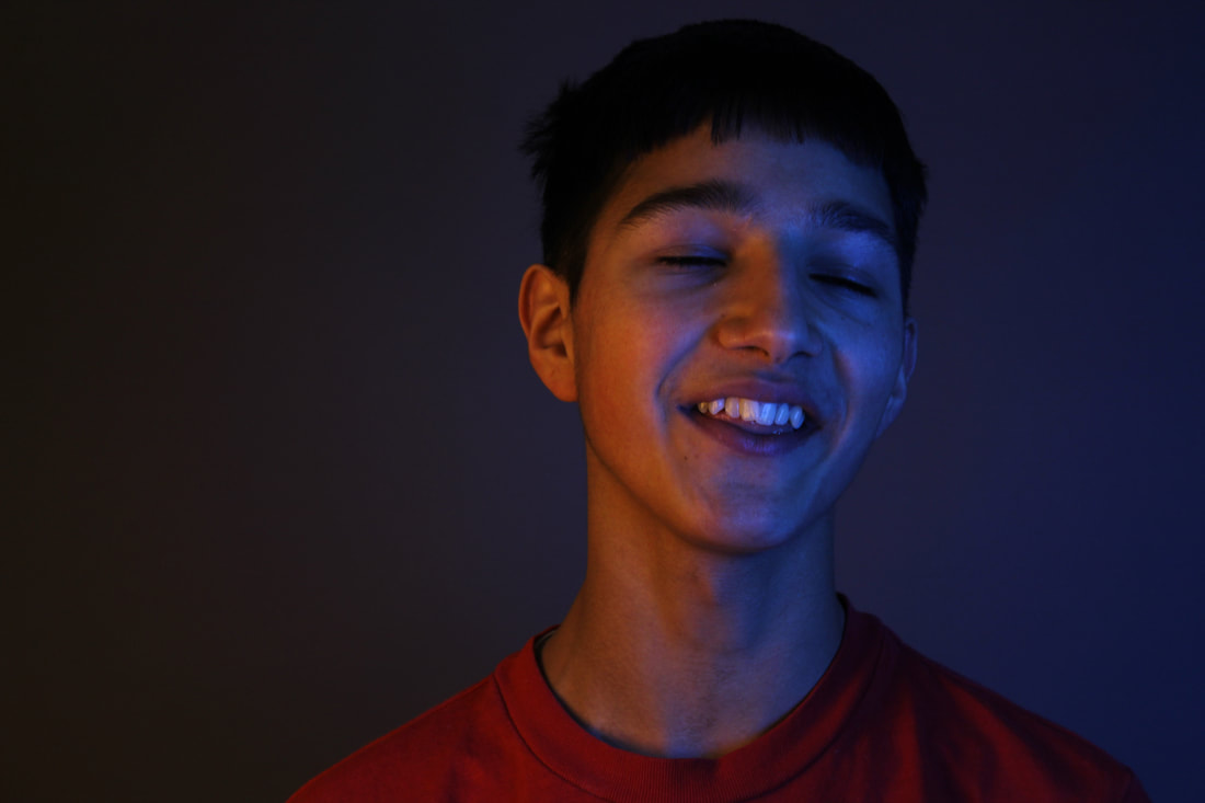
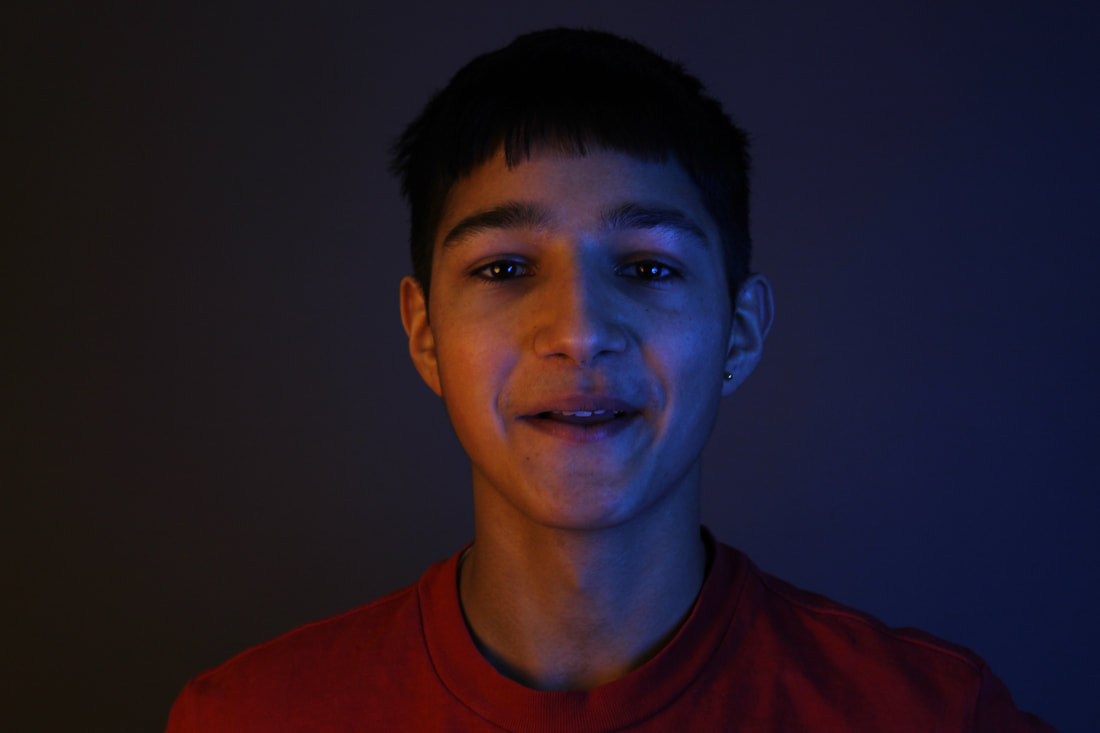
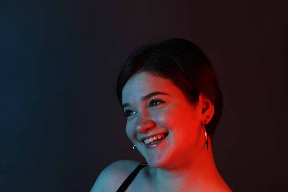
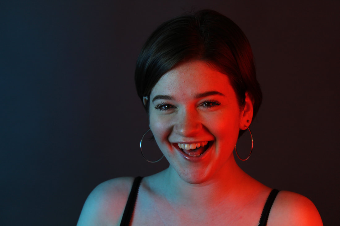
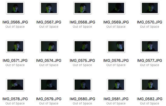
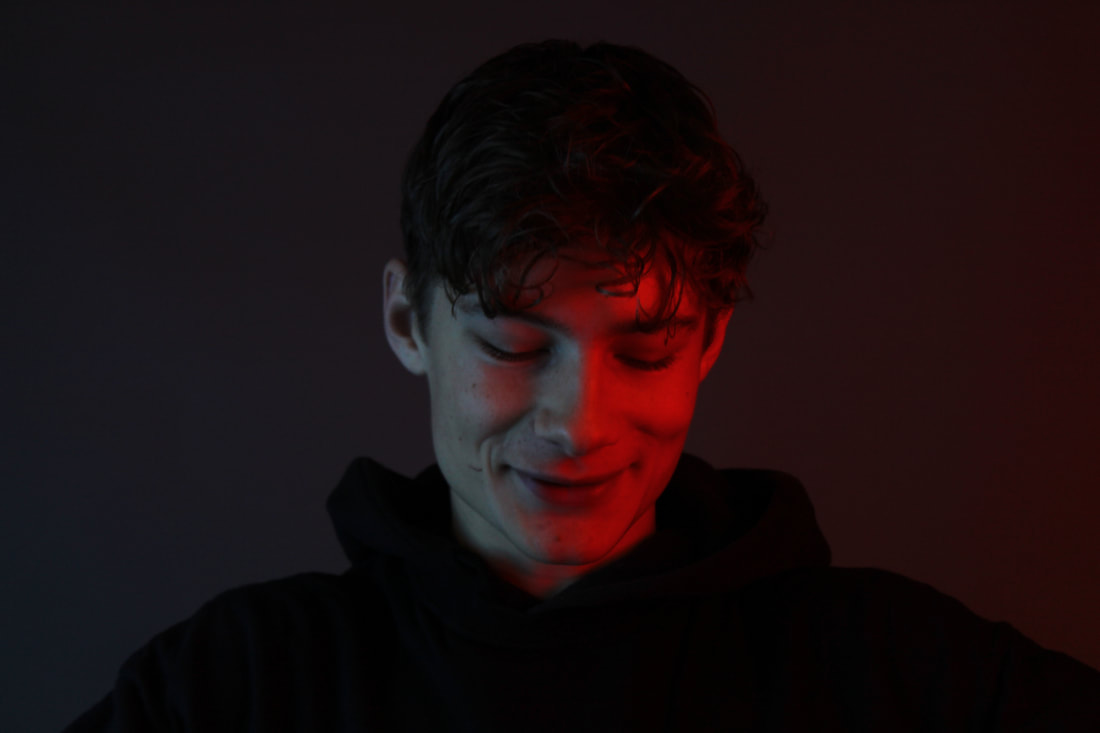
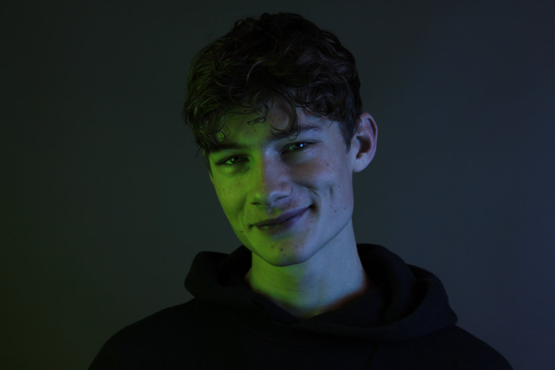
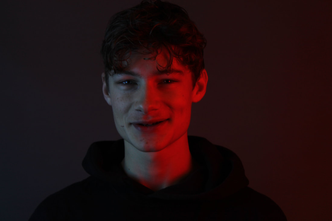
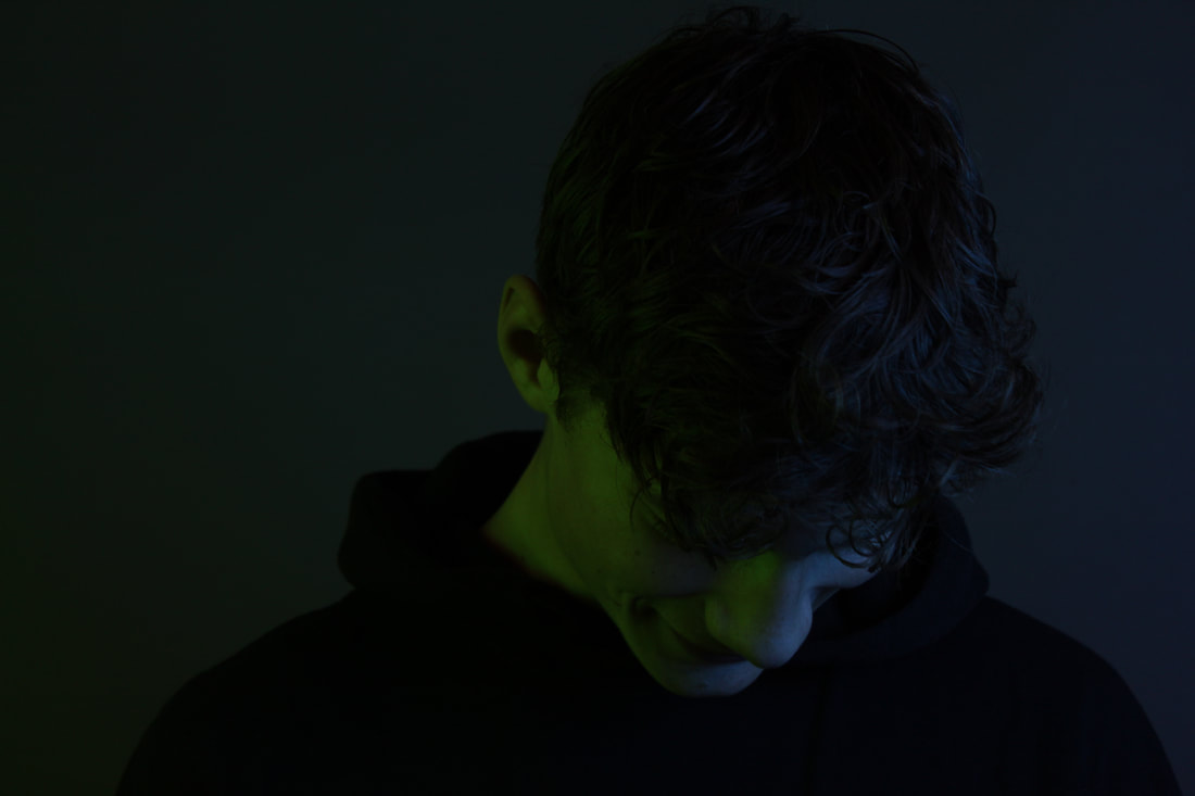
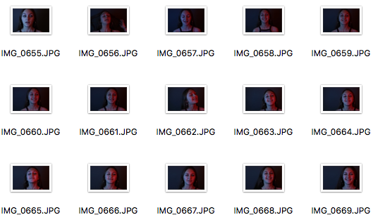
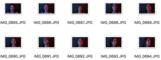
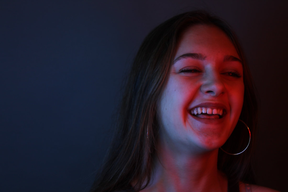
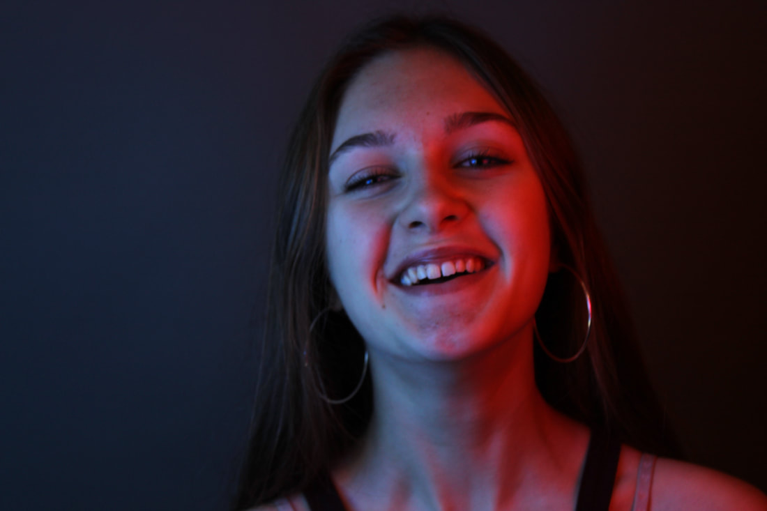
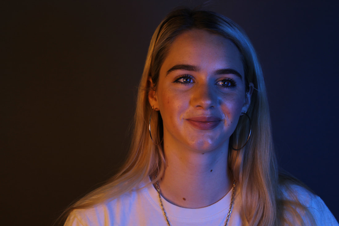
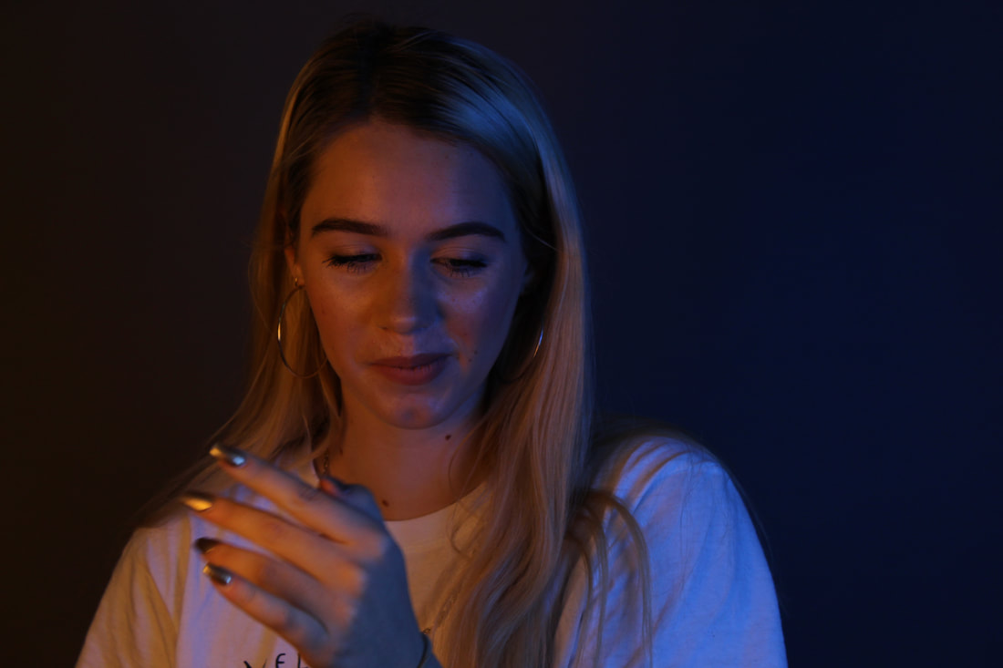
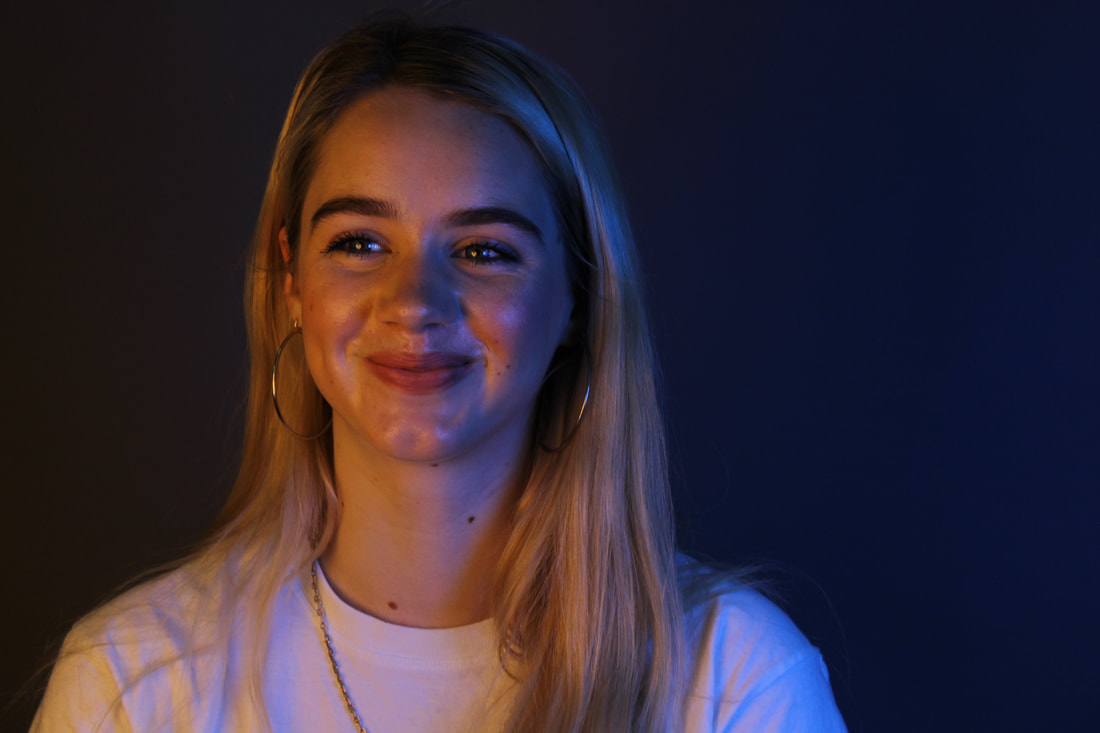
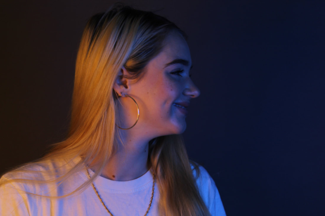
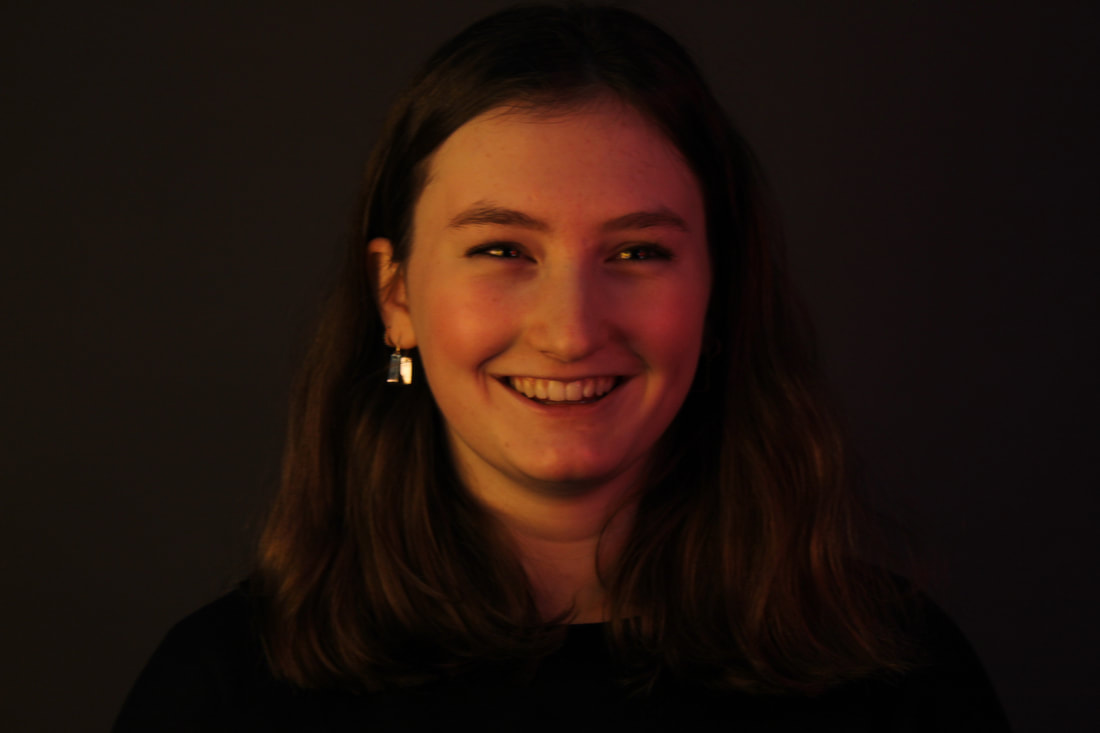
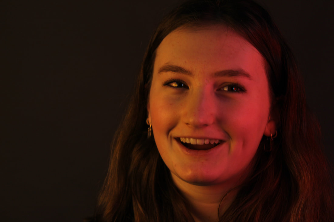
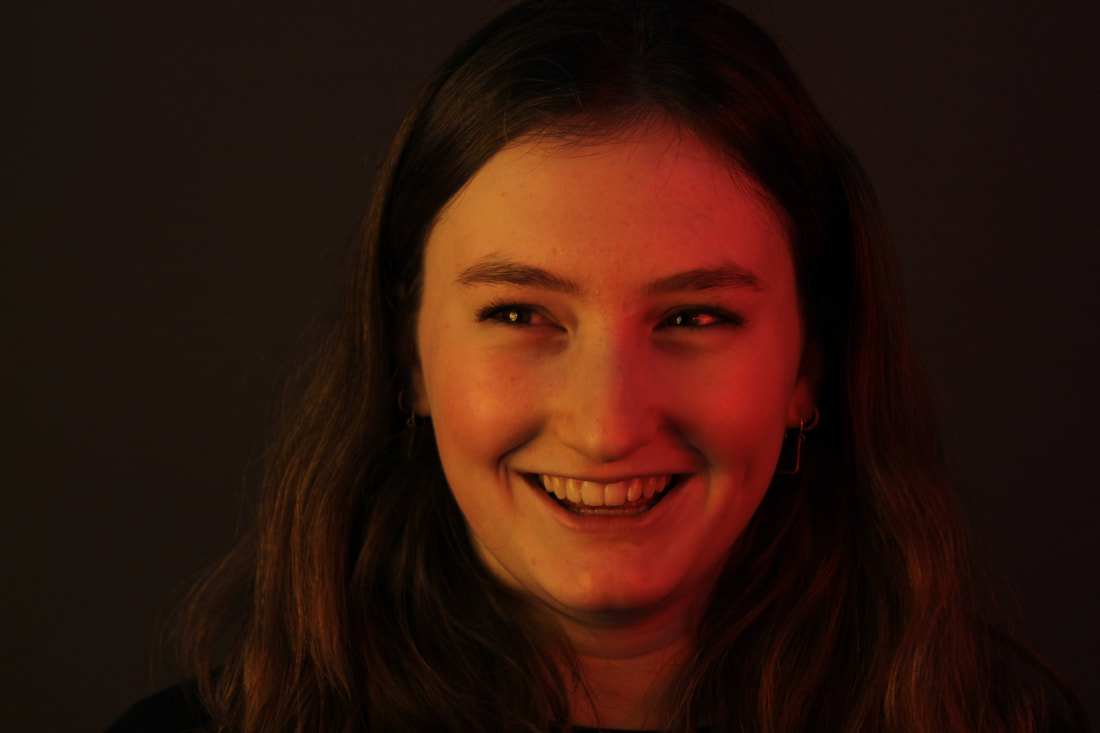
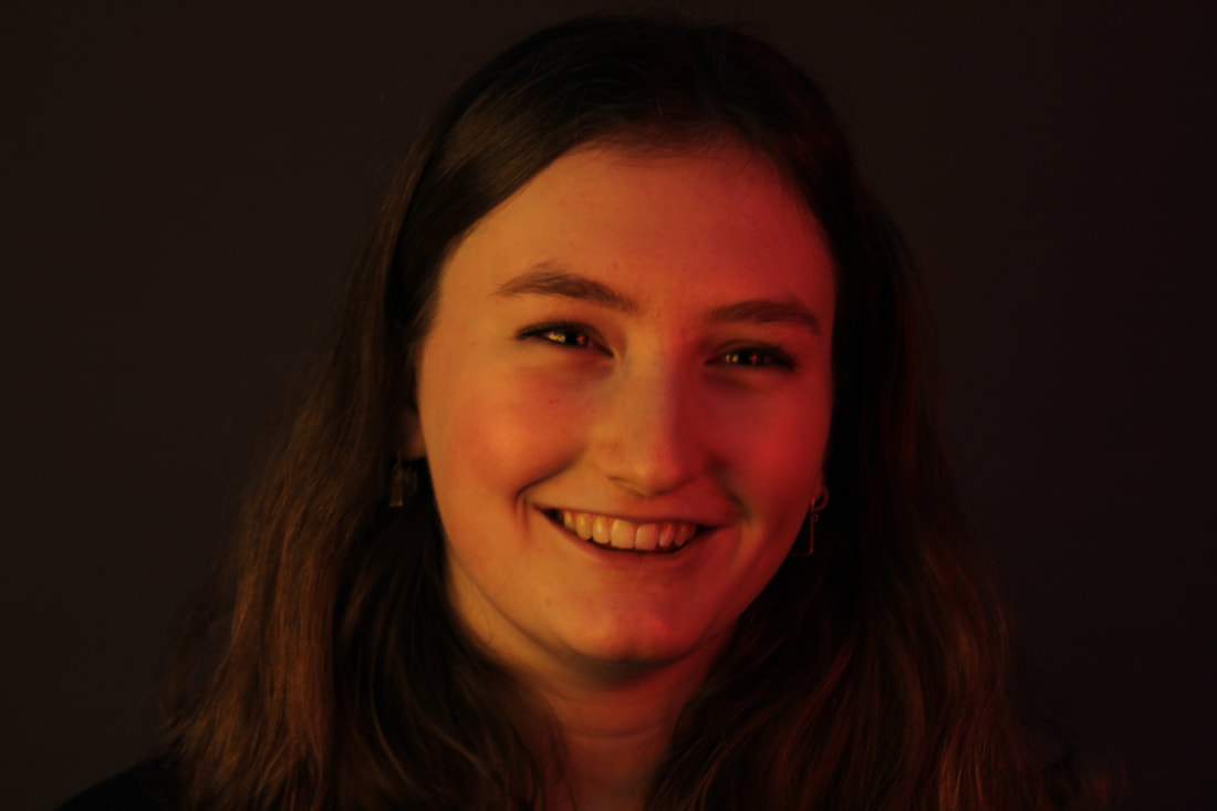
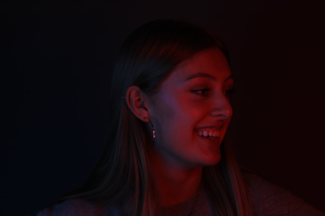
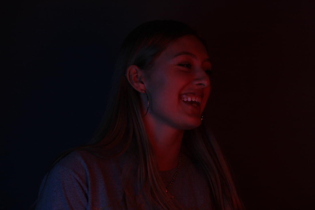
I am developing my final piece idea by photographing many different people portraying emotions with a blank background and colourful lights so the focus is purely on the emotion of the photo. These are the photos of the people I have taken.
RUBUEN
These photos didn't turn out exactly as I wanted as he is talking in most of them. I was aiming to catch some smiling facial expressions when he was talking but I didn't get any good ones so theres some more below I've taken.
I didn't take nearly as many as I did the first time with Rubuen because the photos were just coming out a lot better this time round.
|
|
|
|
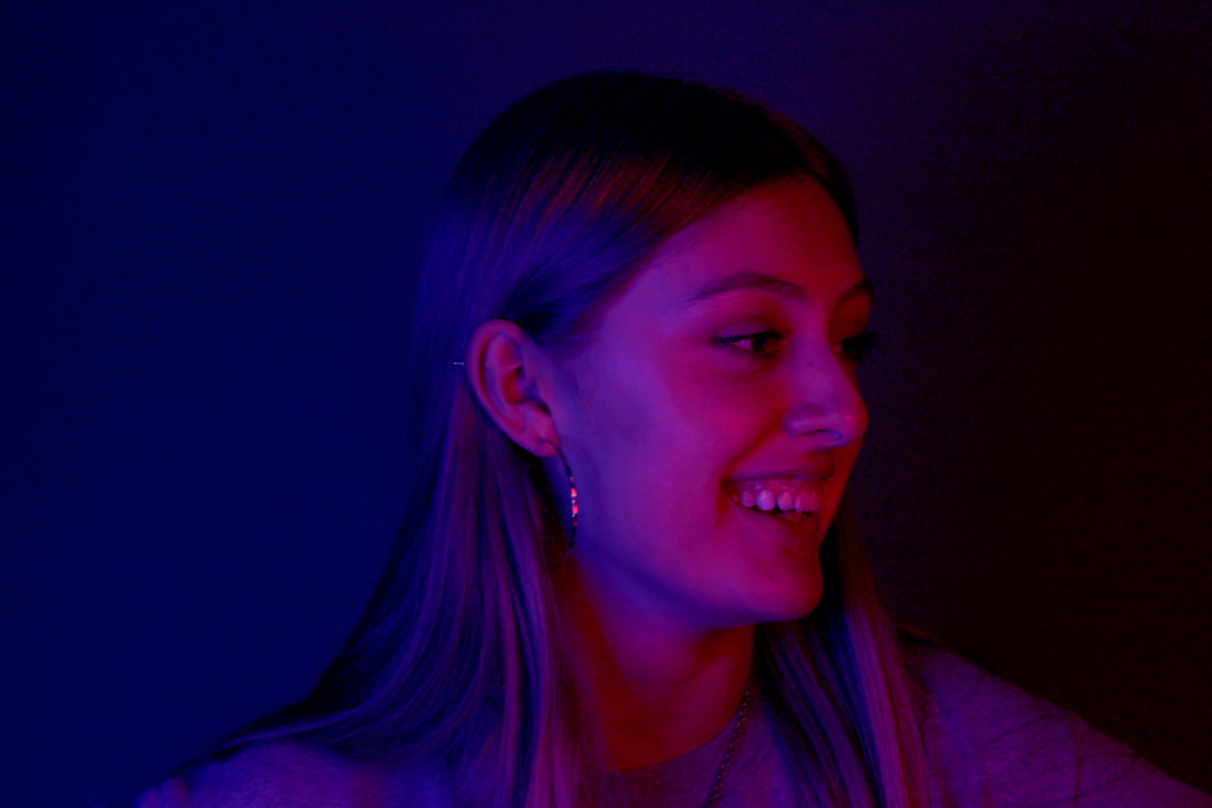
RUBY
|
|
ALFIE
|
|
LEONA
|
|
FLORA
|
|
|
|
JASMINE
|
|
|
|
GABY
|
|
|
|
IZZY
|
|
|
|
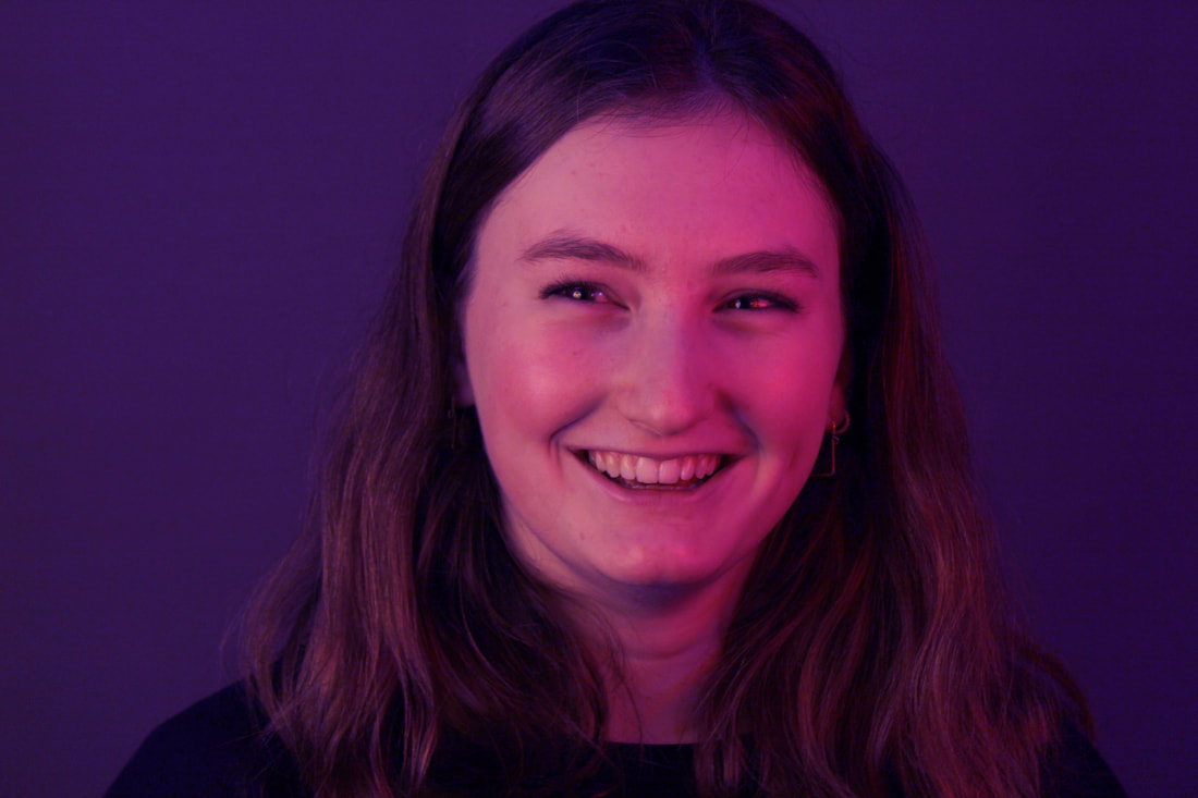
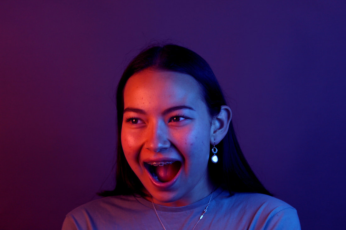
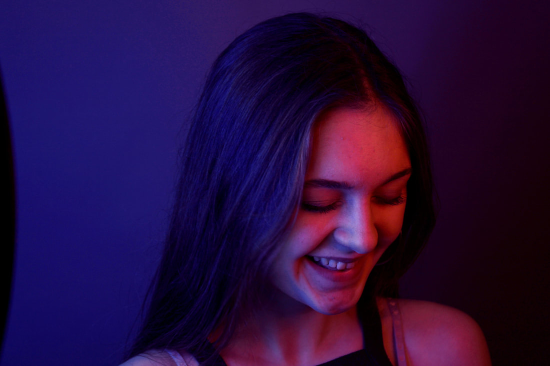
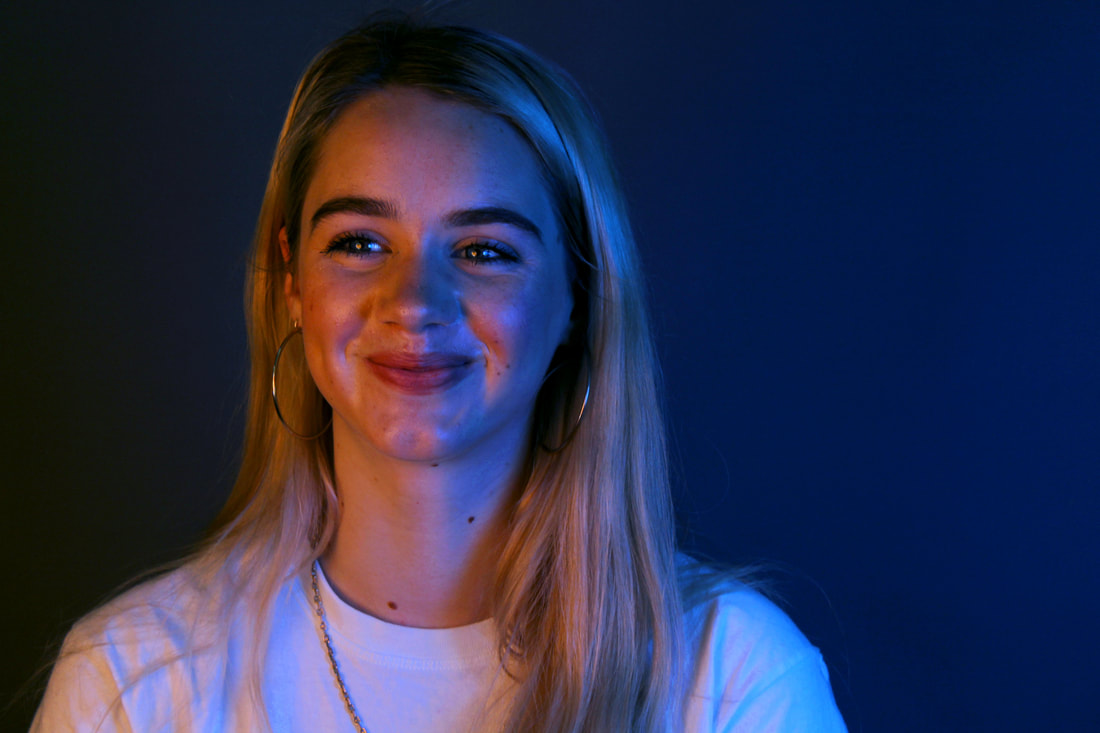
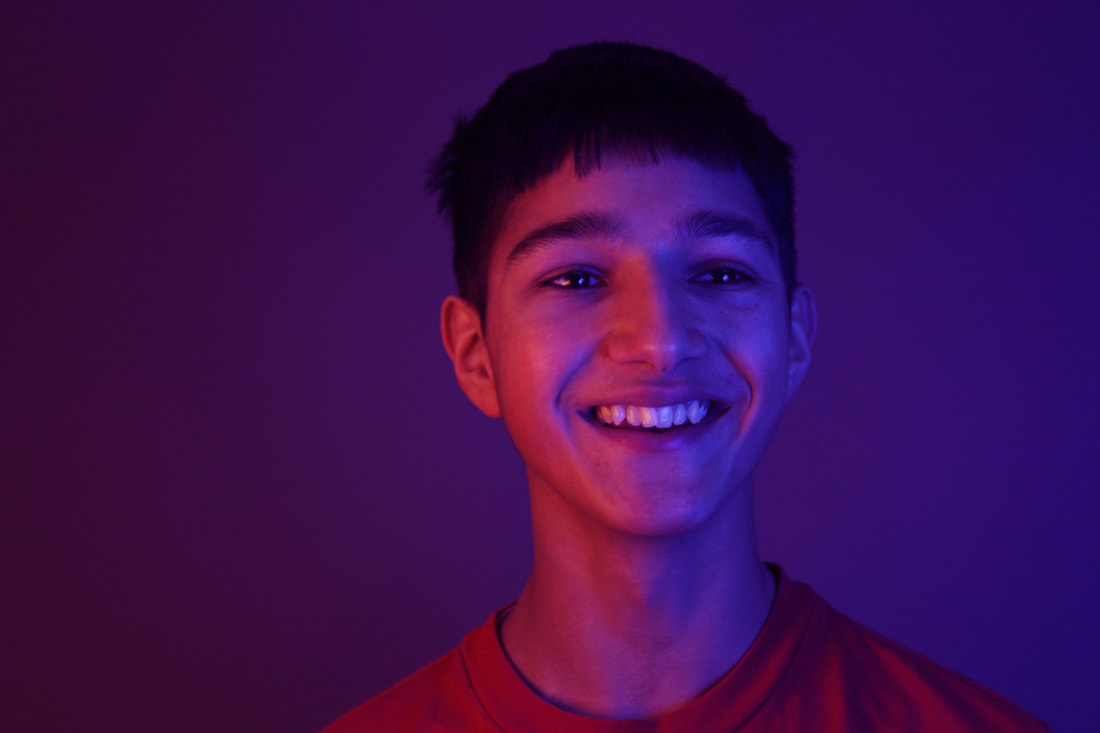
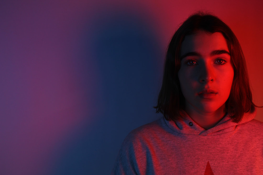
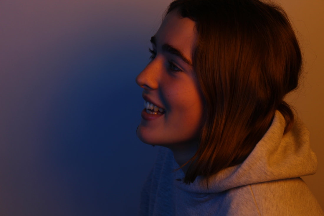
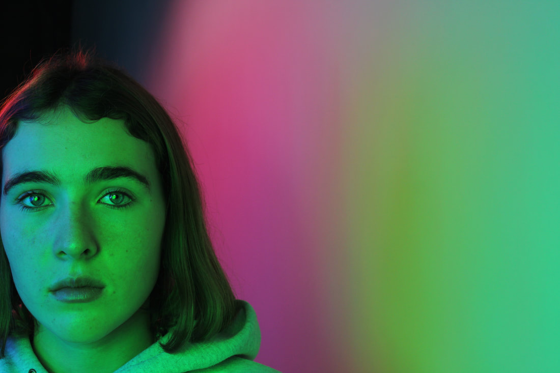
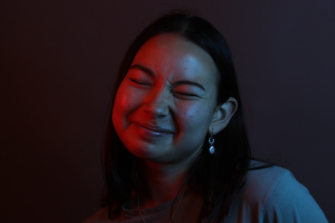
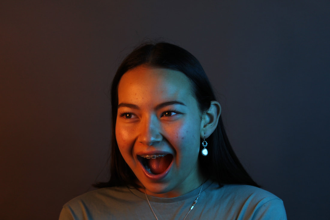
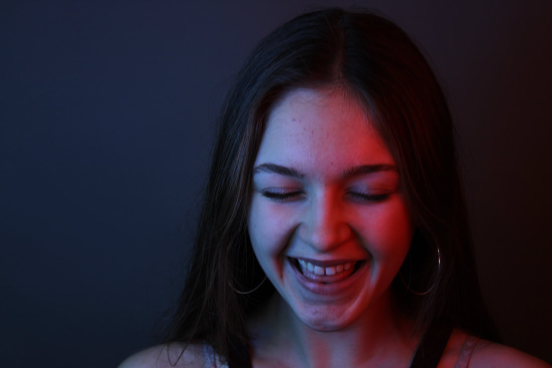
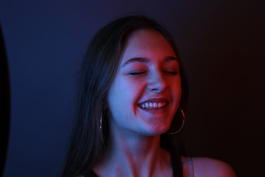
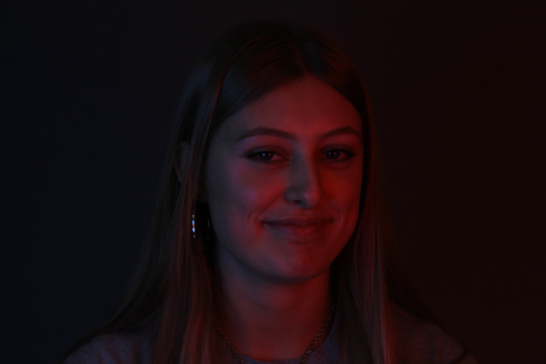
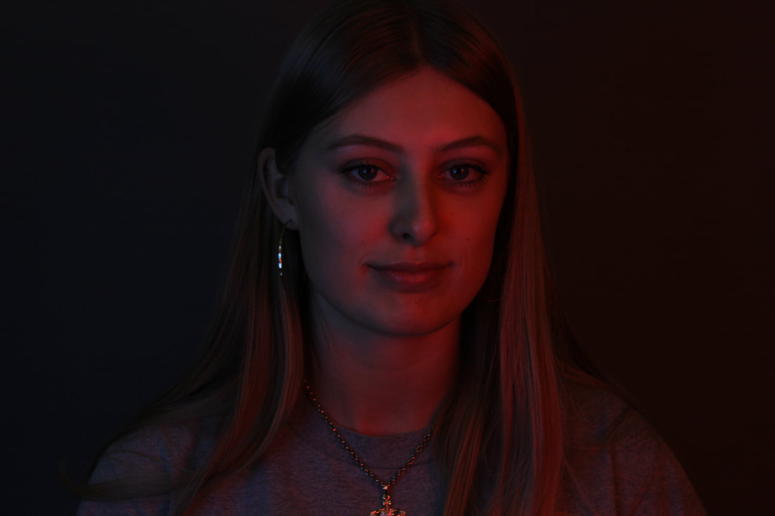
FINAL PIECE
So for my final piece I have photographed some people under the bright gel lights to capture these intense and personal photos. I spoke to them while I photographed them to try and capture real emotions such as laughter or surprise. I then edited them on photoshop to intensify the colours and to make the features stand out more so the photo is completely focused on the emotion they are feeling. These are my final photos.